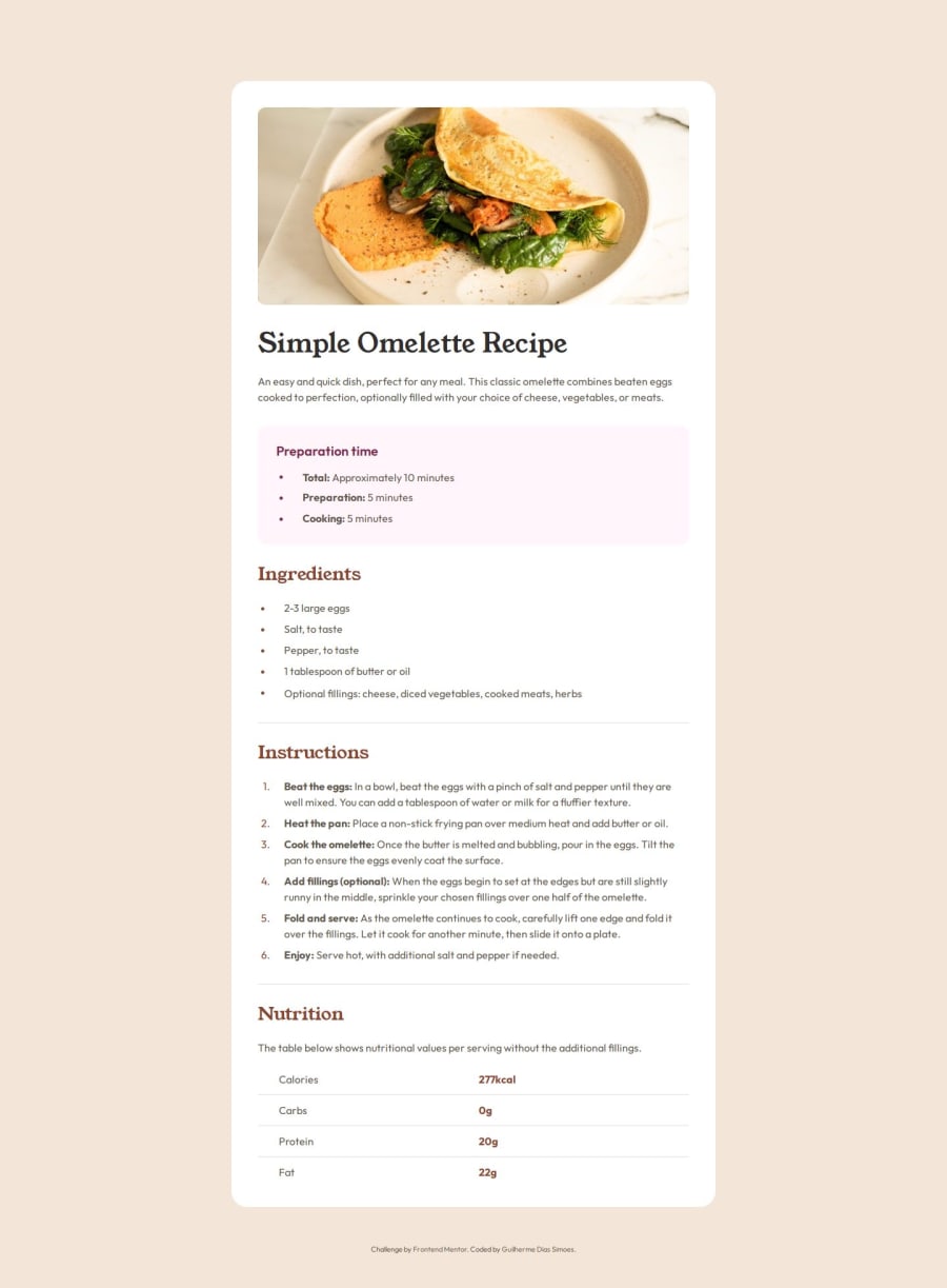
Submitted 8 months ago
Simple solution using variable fonts
#accessibility
@gdsimoes
Design comparison
SolutionDesign
Solution retrospective
What are you most proud of, and what would you do differently next time?
I am most proud of the work I did with the fonts. But next time I'll try to use a framework to handle that for me.
What challenges did you encounter, and how did you overcome them?Setting up the variable fonts and getting the table to look correctly was surprisingly difficult. Kevin Powell's YouTube channel helped me a lot in this.
What specific areas of your project would you like help with?The font rendering on Figma was slightly different than the one on the browsers. Can I do something about this?
Community feedback
Please log in to post a comment
Log in with GitHubJoin our Discord community
Join thousands of Frontend Mentor community members taking the challenges, sharing resources, helping each other, and chatting about all things front-end!
Join our Discord
