Design comparison
Solution retrospective
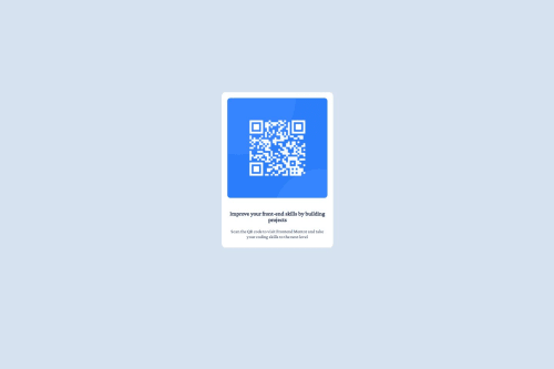
I think the solution is good enough for a Newbie Challenge. I focused mainly on the site's structure and ensuring all components behave as expected.
What specific areas of your project would you like help with?I would mainly like some feedback on my structure:
- setting a container for the 3 components: (the image and the 2 paragraphs) such that:
- position: 'fixed'
- 40% to the left and 40% to the right of the viewport
- width=20% and the element is centered nicely
- each sub-component will be of width: 90% and of margin: 5% so each sub-component will be centered nicely within the container
What are other better alternatives, for example? What are the potential issues with my approach?
Community feedback
- @fastcheetahPosted 4 months ago
Nice work on your code but i would want to say you should use rem instead of fixed values like pixels. REM help ensure consistency across different devices and screen sizes. Since REMs are based on the root font size, they'll adjust automatically to fit the size of the device screen. You can use rem by dividing your pixels values by 16 which is the default. Also your font-family is not the same as the one needed for the project. Example: @font-face { font-family: "Inter"; src: url(Inter/Inter-VariableFont_slntwght.ttf); } and u can target by : p{ font-family: "Inter"; }
Marked as helpful1@ayhem18Posted 4 months ago@fastcheetah Greatly appreciate your feedback. I haven't investigated the different units previously and mainly focused on how the percent operator work in CSS. Nevertheless, after your comment, I think CSS units might be worth while.
0@fastcheetahPosted 4 months agoThanks for the appreciation and once again nice work on your code @ayhem18
1 - @jdcc1024Posted 4 months ago
Hey Ayhem! Congrats on getting your challenge up and running! I saw your feedback questions while scrolling through my feed.
An alternative to the solution you used (absolute positioning, viewport percentages, etc) is to use the flexbox concept. In my experience, flexbox is a lot closer to what you will encounter from UX developer designs and responsive layouts in the future.
For the QR code challenge, take a look at flexbox, flex-direction, justify-content, and align-items. These 4 css settings will allow you to center your QR code card into the middle of the screen.
{ display: flex, flex-direction: column, justify-content: center, align-items: center }
In your current solution, one drawback to using % is the look of the page. By using absolute and % based size calculations, your design may look very different to what your future customers see, depending on their window size. You can see it for yourself if you open your page and shrink the width of the window. The QR code will shrink, and you will end up with too much whitespace on a smaller-width screen.
Make sure to build the habit of testing your UI at different window sizes :) Keep up the good work!
1@ayhem18Posted 4 months ago@jdcc1024 Flex Layout is definitely the optimal solution. Nevertheless, I thought of this first challenge as an opportunity to experiment with different CSS features. Thank you for pointing out the issues with the simple solution.
0
Please log in to post a comment
Log in with GitHubJoin our Discord community
Join thousands of Frontend Mentor community members taking the challenges, sharing resources, helping each other, and chatting about all things front-end!
Join our Discord