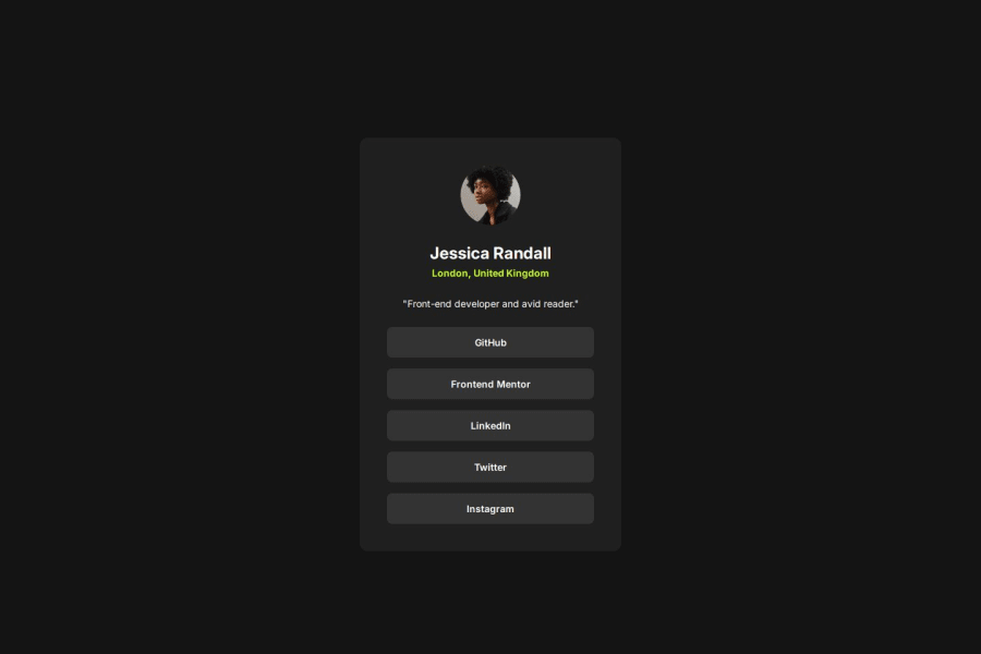
Simple solution to social links profile challenge
Design comparison
Solution retrospective
Please give me tips on what i can improve and also what i can do different to make the challenge better than the normal one?
Please log in to post a comment
Log in with GitHubCommunity feedback
- P@Stroudy
Great solution, I found it hard to give any feedback, Amazing job with this! You’re making fantastic progress. Here are some small tweaks that might take your solution to the next level…
- This should really be a
<ul>because there is no order,
<ol class="links"> <li><a href="#">GitHub</a></li> <li><a href="#">Frontend Mentor</a></li> <li><a href="#">LinkedIn </a></li> <li><a href="#">Twitter</a></li> <li><a href="#">Instagram</a></li> </ol>- Maby explore downloading the fonts and add them to your CSS with
@font-face, Downloading fonts and using@font-facein CSS is beneficial because it improves performance by reducing external requests, provides better control over font styling, and ensures consistent rendering across different browsers and devices.
Great job taking the time to learn! Your efforts are paying off, and I hope these insights guide you to even more success. Keep pushing forward, and remember, you’ve got this! Enjoy your coding adventures! 💪
Marked as helpful - This should really be a
Join our Discord community
Join thousands of Frontend Mentor community members taking the challenges, sharing resources, helping each other, and chatting about all things front-end!
Join our Discord
