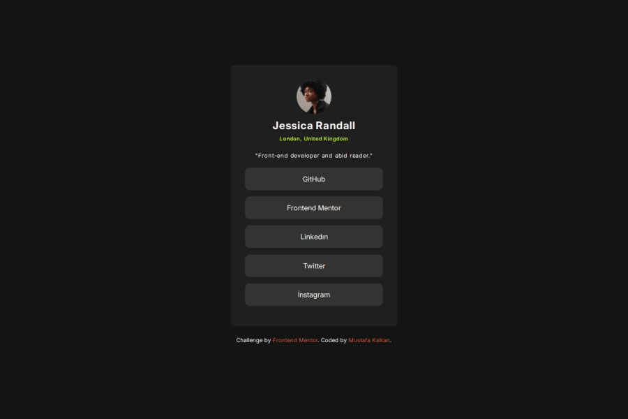
Simple social media links using flexbox and semantic tags
Design comparison
Solution retrospective
I generally love using the Hover effect. I will also make this product again with my own personalized fonts and colors.
What challenges did you encounter, and how did you overcome them?After finishing the project, I remembered that the list items were actually links, so I rewrote the CSS. What made me realize this was that the mouse cursor changed when hovering over the text, but stayed the same when hovering over the spaces next to it.
What specific areas of your project would you like help with?In general, I would be happy if you could express your opinion on whether the labels and main structure are used nicely and efficiently. Whether the design can be made simpler and with less code. Also, if there is something you would like to do differently in the CSS section, I would be happy if you could inform me.
Community feedback
- @KapteynUniversePosted 4 months ago
Hey mkalkandev, nice job.
List items and anchor tags should be other way around
  <li><a href="#">GitHub</a></li>
  <li><a href="#">Frontend Mentor</a></li>
  <li><a href="#">LinkedIn</a></li>
  <li><a href="#">Twitter</a></li>
  <li><a href="#">Instagram</a></li>
Images need a meaningful alt text, unless decorative.
Do not skip heading levels . Also if you used them for sizes don't :D
Rest looks nice. I also recommend you to use a modern CSS reset, or you can check Andy Bell's reset too
Marked as helpful2@mkalkandevPosted 4 months ago@KapteynUniverse Hey. Thanks for your feedback, it's very useful for me. I'll reverse the list and link tags and try again. Other than that, I don't know much about what meaningful alt text should be like and modern css reset, so I'll learn more about these topics. Thanks.
1
Please log in to post a comment
Log in with GitHubJoin our Discord community
Join thousands of Frontend Mentor community members taking the challenges, sharing resources, helping each other, and chatting about all things front-end!
Join our Discord
