

Design comparison

Solution retrospective
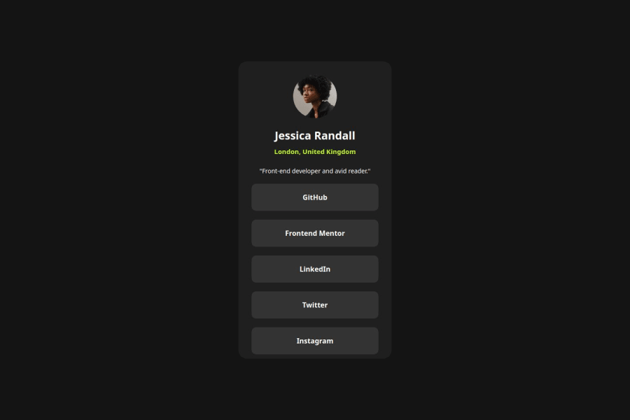
I am basically proud because I have successfully used the CSS Flex to make this project
What challenges did you encounter, and how did you overcome them?I encountered the challenge to make the 5 social medias separated from the main area.
But when I applied a padding in the area, it was solved.
What specific areas of your project would you like help with?Please tell me if there is any better way to make the 5 social media names separated from the main area.
Community feedback
- @uzainmalik123Posted 2 months ago
you just have one container and all the stuff in it you can separate the social media link and the upper content and just flex box to make it simpler and it would suggest use gap with flex box it really helps leave margin as a last option where no flex properties can be used.
0

Please log in to post a comment
Log in with GitHubJoin our Discord community
Join thousands of Frontend Mentor community members taking the challenges, sharing resources, helping each other, and chatting about all things front-end!
Join our Discord