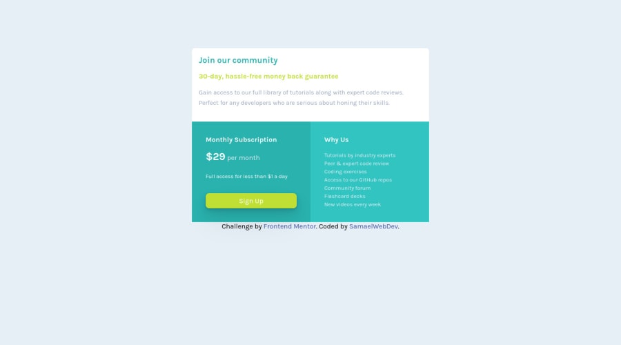
Simple single price grid component solution using CSS Grid & Flexbox
Design comparison
Solution retrospective
I did not really have much trouble building the project to the way it looks right now.
while using CSS Grid I could not figure out how to vertically align the entire CSS Grid container in the middle of the page not just horizontally.
I was not able to figure out how to add a shadow to the grid container as it appears much bigger than the content area.
lastly whenever I'm building a project I'm always guessing the dimensions of the project itself to make it match the original version.
please help me with a solution to that issue and let me know how I can improve.
Community feedback
- @HassiaiPosted over 1 year ago
Replace <p class="invite"> with <h1>, <p class="term"> and <p class="credibility"> with <h2> to fix the accessibility issues.
Generate a new report for the challenge to check your accessibility and error issues.
To center the main on the page using flexbox or grid instead of margin, add min-height:100vh; display: flex; align-items: center: justify-content: center; or min-height:100vh; display: grid place-items: center to the body.
USING FLEXBOX:
body{
min-height: 100vh;
display: flex;
align-items: center;
justify-content: center;
}
USING GRID: body{ min-height: 100vh; display: grid; place-items: center; }Hope am helpful.
Well done for completing this challenge. HAPPY CODING
Marked as helpful0
Please log in to post a comment
Log in with GitHubJoin our Discord community
Join thousands of Frontend Mentor community members taking the challenges, sharing resources, helping each other, and chatting about all things front-end!
Join our Discord
