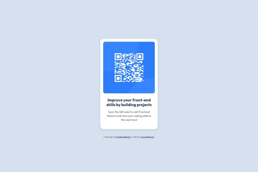
Simple, Semantic & Accessible QR Component (Under 100 Lines of CSS)
Design comparison
Solution retrospective
Since this project was quick to code, I challenged myself to reduce the CSS to 100 lines or less. I focused on treating my CSS like a design system, extracting repeated patterns into small, focused classes. This approach is a little more time-consuming, but I can see how it makes a component like this easy to maintain and scale over time.
Community feedback
- @fbtwitterPosted 7 months ago
I appreciate your attention to detail, especially the addition of titles to images and the use of the <small> element for accessibility. However, based on best practices in web development, wrapping these elements in a <figure> tag would provide a clearer structure, as it semantically groups the image with its associated content. This approach enhances both accessibility and the logical organization of the page.
0
Please log in to post a comment
Log in with GitHubJoin our Discord community
Join thousands of Frontend Mentor community members taking the challenges, sharing resources, helping each other, and chatting about all things front-end!
Join our Discord
