Design comparison
SolutionDesign
Solution retrospective
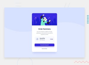
With my crappy monitor I wasn't 100% sure about the colors and shadow effects. Other than that I think it went pretty smooth :)
left the "annual plan" part centered, as I thought it seemed nicer that way
thanks for checking it out o/
Community feedback
- @afrusselPosted about 3 years ago
Good work. There is some width and height mismatch on the card. I would like to request you please take a look at my solution it may help you to find your issues
Marked as helpful2@aanacifPosted about 3 years ago@afrussel Thank you, Sir. Yea as I didn't have the figma files pretty much had to eyeball all the measurements. Will take a look at yours in a bit ;)
0
Please log in to post a comment
Log in with GitHubJoin our Discord community
Join thousands of Frontend Mentor community members taking the challenges, sharing resources, helping each other, and chatting about all things front-end!
Join our Discord
