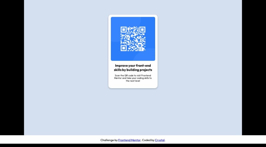
Design comparison
SolutionDesign
Solution retrospective
I feel like every time I step away from one way of styling (vanilla CSS, for example) and use something else (Tailwind, etc), I forget so much!
This little QR code was good practice in the basics, I think. I tried to make it responsive (using flex) and match the images provided. I used PerfectPixel (browser extension) for the first time, and I thought it was useful.
Question:
- Once you have things more or less how you want them, how do you deal with making tiny changes (down to .5vh or other tiny tweaks to sizing)? I found it quite tedious to keep making tiny changes near the end of the project.
Community feedback
Please log in to post a comment
Log in with GitHubJoin our Discord community
Join thousands of Frontend Mentor community members taking the challenges, sharing resources, helping each other, and chatting about all things front-end!
Join our Discord
