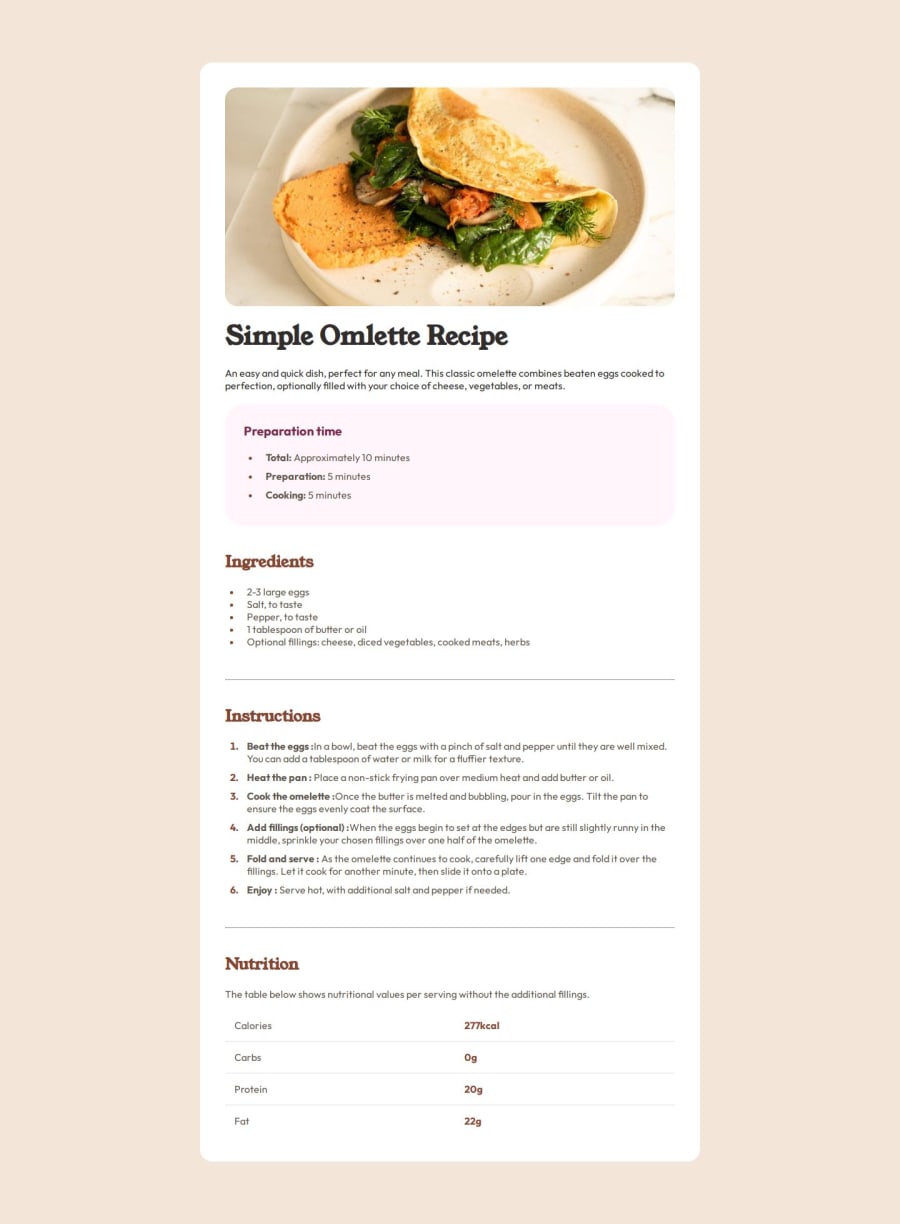
Design comparison
SolutionDesign
Community feedback
- @saintnic84Posted 5 months ago
Your code looks pretty code. There are only a few real suggestions I think that would help. First would be using line height to improve the space between your list elements, so that they're not so close together. Secondly, you used the wrong color for your hr borders. You used hsl(30, 54%, 90%), instead of hsl(30, 18%, 87%), which I think was a simple mistake. Keep up the great work!
Marked as helpful0
Please log in to post a comment
Log in with GitHubJoin our Discord community
Join thousands of Frontend Mentor community members taking the challenges, sharing resources, helping each other, and chatting about all things front-end!
Join our Discord
