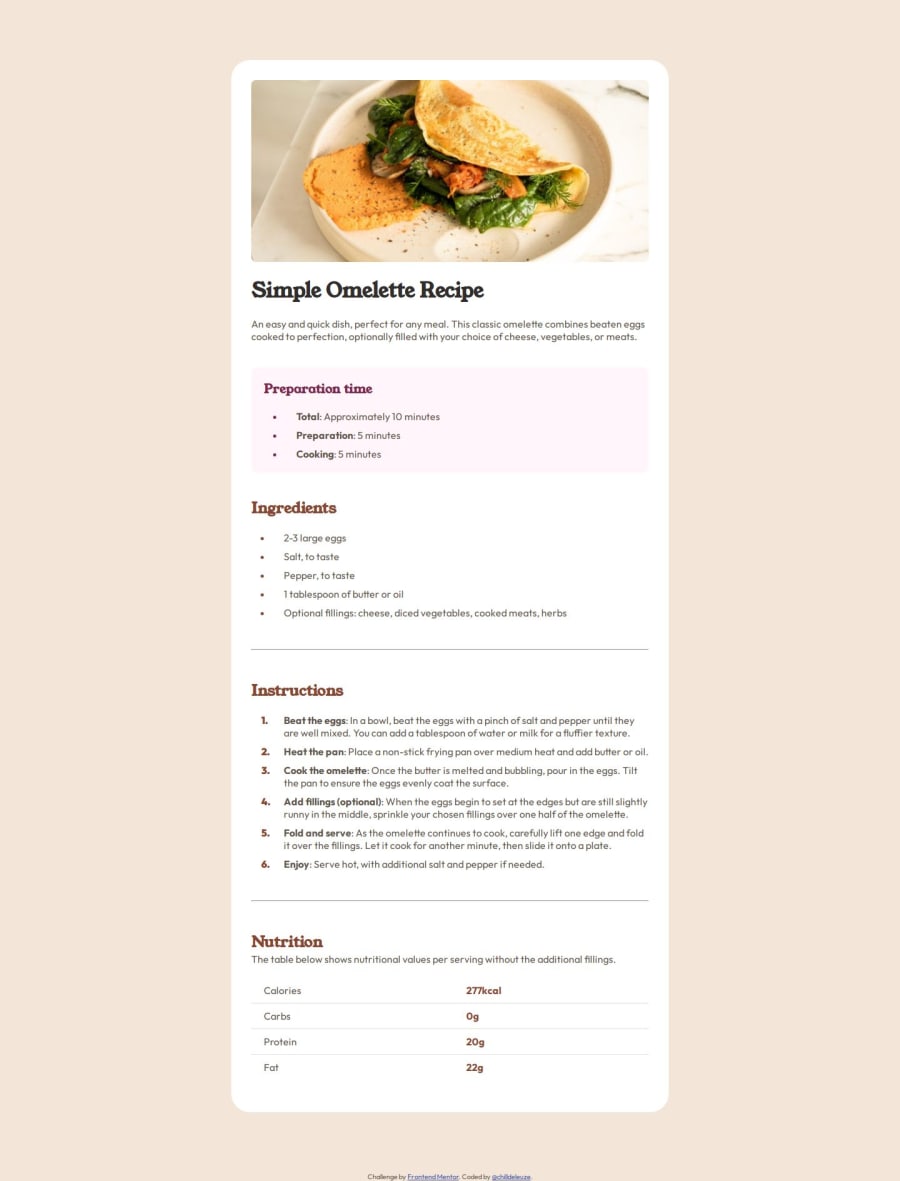
Design comparison
SolutionDesign
Solution retrospective
What are you most proud of, and what would you do differently next time?
I'm getting the hang of using variables and I also used a few more complex selectors (sibling selector).
What challenges did you encounter, and how did you overcome them?This was more challenging than the previous ones. I had some trouble styling the list-markers, especially for the numbered list.
Community feedback
- @abigailjuliePosted 5 months ago
The font-weight is more nuanced than what's shown. Break lines should appear more consistent. Line spacing of text looks off. Adjust the spacing of the bullets in the ul li. Looks great!
0
Please log in to post a comment
Log in with GitHubJoin our Discord community
Join thousands of Frontend Mentor community members taking the challenges, sharing resources, helping each other, and chatting about all things front-end!
Join our Discord
