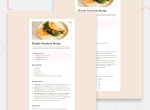
Design comparison
SolutionDesign
Community feedback
- @MAY55APosted 8 months ago
Good work, the solution generally matches the design, and the code looks clean and readable.
However, some improvements can be made :
- The divs should be changed to sections to make better use of semantic HTML elements.
- The h1 and h2 font sizes should be slightly bigger, have lower font weights, and be more responsive.
- The background color used in the solution isn't the one used in the design.
- For mobile screens, the image should fill the whole width of the screen meaning there is no padding around the image (look carefully at the mobile design).
0
Please log in to post a comment
Log in with GitHubJoin our Discord community
Join thousands of Frontend Mentor community members taking the challenges, sharing resources, helping each other, and chatting about all things front-end!
Join our Discord
