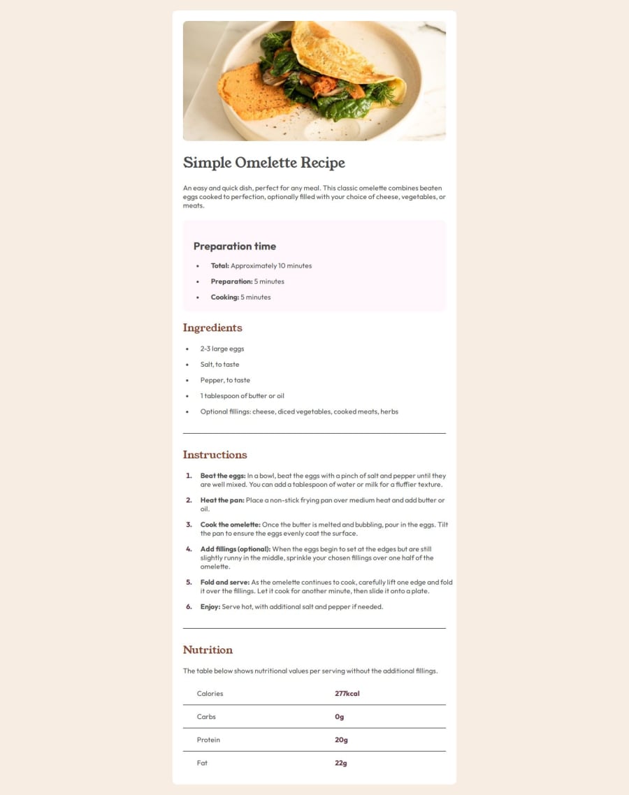
Design comparison
Solution retrospective
There were some new elements I never used, like tables, style-type with spans et cetera. I had to look up a lot and eventually kinda lost myself in the code. Needed a lot of help from ChatGPT, but the good is that I understand every step it takes. So I didn't blindly copy paste it, but wrote and read every line of code to properly understand it.
What challenges did you encounter, and how did you overcome them?The alignment of the box didn't work properly (had to use min-height instead of height) and declaring :root CSS vars was bit of a struggle to understand. But I have them by constantly retrying them.
What specific areas of your project would you like help with?None for now
Please log in to post a comment
Log in with GitHubCommunity feedback
- @JJSanchez33
Excelente. Lo importante es cómo lo aclaras, no se trata de copiar y pegar. La mejor forma de aprender es cometiendo errores y poder superarlos. Muy bueno tu trabajo.
Join our Discord community
Join thousands of Frontend Mentor community members taking the challenges, sharing resources, helping each other, and chatting about all things front-end!
Join our Discord
