Solution retrospective
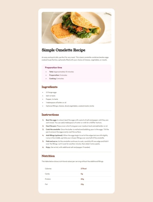
I learned how to fit an image flush to a container, which was a cool technique (my first use of the calc function). I also learned a lot about styling tables and lists.
I also thought a fair amount about the semantic HTML and have hopefully done a good job of that (e.g. making an invisible table header).
What challenges did you encounter, and how did you overcome them?I don't think I nailed the spacing (hard to do from just a jpg of the design) but in the end I settled with some rules which I think look good and provide a consistent sense of space on the page.
What specific areas of your project would you like help with?Safari seems to not like the header font; things look a lot better in Chrome. It's good to be aware of these discrepancies but I would like to learn more about how they can be resolved (if at all).
Feedback on my semantic HTML would be welcome.
Please log in to post a comment
Log in with GitHubCommunity feedback
No feedback yet. Be the first to give feedback on Neil's solution.
Join our Discord community
Join thousands of Frontend Mentor community members taking the challenges, sharing resources, helping each other, and chatting about all things front-end!
Join our Discord