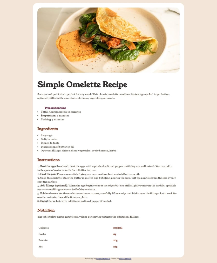
Simple Recipe main page using html(tables and lists) and CSS
Design comparison
Solution retrospective
1.I am most proud of my implementation of the responsive design aspect.
2.It was interesting to learn how to use media queries effectively and ensure the web page looks good on various devices.
3.Next time, I would focus on using links to join different pages so that more recipes can be added.
4.I would also use JavaScript to add more interactivity to the project, such as implementing a feature to customize the omelette recipe based on user preferences.
What challenges did you encounter, and how did you overcome them?-
The challenges I encountered were: aligning the table cells in the nutrition section properly and indenting the Preparation time code.
-
I initially struggled with CSS styling to achieve the desired layout.
-
However, after researching and experimenting with different CSS properties, I was able to resolve the issue by :
- Ensure that the table has equal columns by using width: 100%; and border-collapse: collapse;
- Creating a class indented list and styling it with padding so that there are tab spaces.
Any feedback on how to further improve this webpage is welcome.
Community feedback
- @grace-snowPosted 12 months ago
This is not a good challenge to attempt first. I recommend you pause this one for now and try the QR code challenge first instead.
This is not responsive and needs a lot of changes - all the usual foundational problems everyone faces. But it will take a long time to go through them all on this size.of challenge. It would be must easier to explain on the QR code challenge.
0
Please log in to post a comment
Log in with GitHubJoin our Discord community
Join thousands of Frontend Mentor community members taking the challenges, sharing resources, helping each other, and chatting about all things front-end!
Join our Discord
