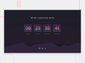
Design comparison
SolutionDesign
Solution retrospective
How could I have done this better?
Community feedback
- Account deleted
It works like every other countdown, it's just the design that needs a little bit of works.
The cards get small in width when you down-size resulting in some numbers peeping out of their container and it would have been nice to see the flipping animation since everyone just skips it.
0
Please log in to post a comment
Log in with GitHubJoin our Discord community
Join thousands of Frontend Mentor community members taking the challenges, sharing resources, helping each other, and chatting about all things front-end!
Join our Discord
