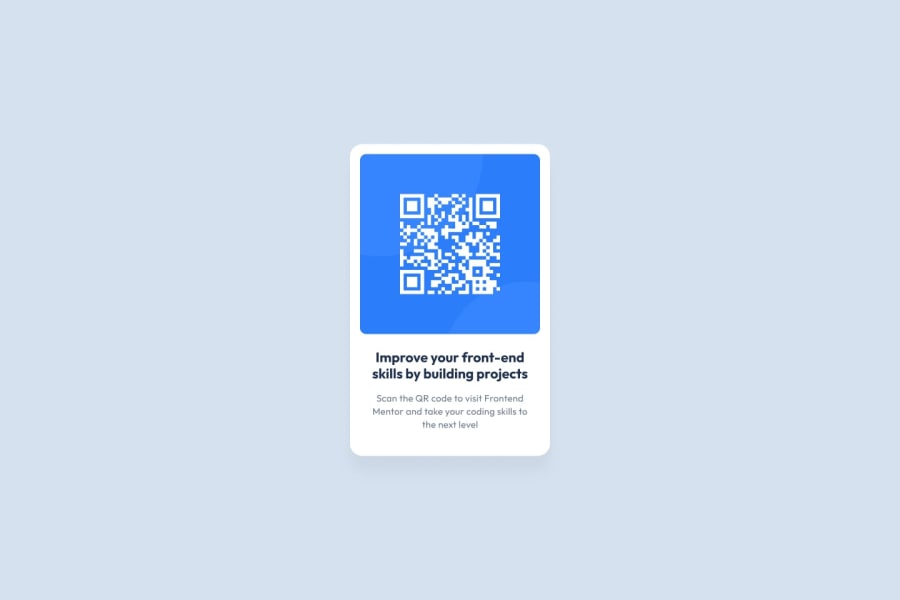
Design comparison
Solution retrospective
Please leave a comment on the code I used and what I should have used instead or what I could have used instead. I actually did this one a few days ago but I revamped it after seeing Kevin Powel using CSS variables, it looks and feels way easier to use compared to writing every color out. Please feel free to review my code and send back feedback
Community feedback
- @gfunk77Posted about 1 year ago
Haarith, Nice work on the qr code card. Looking at your css, I would suggest removing all the selectors that you don't actually need. For example, you could do * { margin: 0, box-sizing: border-box } and eliminate the ::before and ::after. Keep img { display: block; width: 100% } but you can remove the rest. You can delete all of these because you are not actually using them and they won't have any impact on your code ->
- Remove built-in form typography styles / input, button, textarea, select { font: inherit; } /
- Avoid text overflows / p, h1, h2, h3, h4, h5, h6 { overflow-wrap: break-word; } /
- Create a root stacking context / #root, #__next { isolation: isolate; } / the actuall html page height*/
html{ height: 100%; }
I think your css would look a lot cleaner with only the essentials needed for your component. Your :root variables look good! Well done!
Marked as helpful1
Please log in to post a comment
Log in with GitHubJoin our Discord community
Join thousands of Frontend Mentor community members taking the challenges, sharing resources, helping each other, and chatting about all things front-end!
Join our Discord
