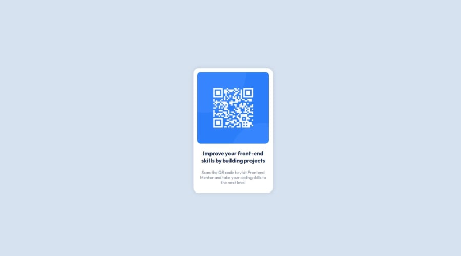
Design comparison
Solution retrospective
Hi Developers!
I'm just a beginner to have curiosity to learn more and quickly. I have built this project with basic HTML and CSS.
I have learnt and practice how to use variables in CSS and flex box. How to optimize my code in simple and better way?
Any Suggestion to improve my code and techniques are welcome!
Community feedback
- @danielmrz-devPosted 9 months ago
Hello @DhahiraThesneem!
Your solution looks great!
I have a couple of suggestions (about semantic HTML) for improvement:
š First: Use
<main>
to wrap the main content instead of<div>
.Think of
<div>
and<span>
in HTML like plain boxes or placeholders. They're handy for holding content, but they don't tell us anything about what's inside or what it's meant for on the webpage.š Second: Use
<h1>
to<h6>
for the main title instead of<p>
.The tag
<p>
is meant for paragraphs. For titles, we have the HTML headings (the tags<h1>
to<h6>
).Here's a quick guide on how to use them:
Unlike what most people think, it's not just about the size and weight of the text.
- The
<h1>
to<h6>
tags are used to define HTML headings. <h1>
defines the most important heading.<h6>
defines the least important heading.- Only use one
<h1>
per page - this should represent the main heading/title for the whole page. And don't skip heading levels - start with<h1>
, then use<h2>
, and so on.
All these tag changes may have little or any visual impact but they make your HTML code more semantic and improve SEO optimization as well as the accessibility of your project.
I hope it helps!
Other than that, great job!
Marked as helpful1@DhahiraThesneemPosted 9 months agoThank you @danielmrz-dev for your valuable suggestion! I surely keep your suggestion in mind while writing codes. One more question, in design-solution comparison screen, it shows that my solution is smaller than design. How to achieve that exact size. I have not use any media query in my code because I think that for this problem media query is not needed. Am I correct?
1@danielmrz-devPosted 9 months ago@DhahiraThesneem
Without the figma design files is a bit hard to get the correct measures, but there's a very useful browser extension called Pixel Perfect. You might wanna try using it.
It's not perfect, but it helps š
Marked as helpful0 - The
Please log in to post a comment
Log in with GitHubJoin our Discord community
Join thousands of Frontend Mentor community members taking the challenges, sharing resources, helping each other, and chatting about all things front-end!
Join our Discord