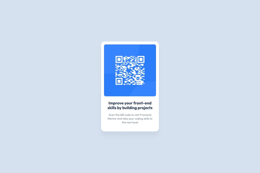
Design comparison
Community feedback
- @correlucasPosted about 2 years ago
👾Hi @Govin-R, congratulations on your first solution!👋 Welcome to the Frontend Mentor Coding Community!
Great solution and a great start! From what I saw you’re on the right track. I’ve few suggestions for you that you can consider adding to your code:
1.When you download the project files there’s a file called
style-guide.mdwhere you can find information such ashsl color codesand thefont-sizefor the headings. The background-color in this case isbackground-color: #D5E1EF2.Use
<main>instead of<div>to wrap the card container. This way you show that this is the main block of content and also replace the div with a semantic tag.3.Replace the
<h2>containing the main title with<h1>note that this title is the main heading for this page and every page needs one h1 to show which is the most important heading. Use the sequence h1 h2 h3 h4 h5 to show the hierarchy of your titles in the level of importance, never jump a level.4.The value you’ve used for the shadow make it too much dark and strong. To improve your box-shadow, you’ve to have in mind two things that make a good shadow,
blurandlow opacityfor smooth shadows. To improve your current shadow, decrease theopacityand increase theblur, try this value instead:box-shadow: 12px 7px 20px 6px rgb(57 75 84 / 8%);If you’re not familiar to box-shadow you can use this site to create the shadow design and then just drop the code into the CSS: https://html-css-js.com/css/generator/box-shadow/
✌️ I hope this helps you and happy coding!
0
Please log in to post a comment
Log in with GitHubJoin our Discord community
Join thousands of Frontend Mentor community members taking the challenges, sharing resources, helping each other, and chatting about all things front-end!
Join our Discord
