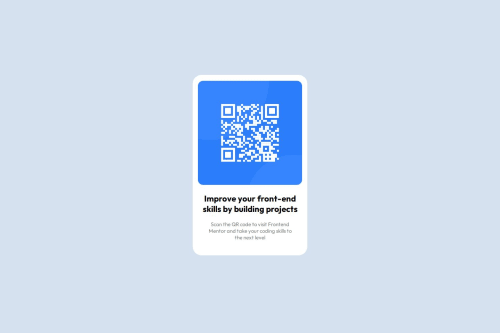
Not Found
Not Found
Not Found
Not Found
Not Found
Not Found
Not Found
Not Found
Not Found
Not Found
Not Found
Not Found
Not Found
Not Found
Not Found
Not Found
Not Found
Not Found
Not Found
Not Found

Submitted

Simple QR-Code Web Page

Ali 40

@ali00209

Desktop design screenshot for the QR code component coding challenge

This is a solution for...

  • HTML
  • CSS
1newbie
View challenge

Design comparison


SolutionDesign

Community feedback

MikDra1 6,090

@MikDra1

Posted

Well done, here are some things to review:

  • Setting html { background-color: #D5E1EF; } applies a light blue background to the entire HTML document. This creates a soft, calming backdrop. Make sure the contrast between this background and your text is sufficient for readability.

  • The body { height: 520px; width: 330px; background-color: white; text-align: center; margin: auto; margin-top: 15%; border-radius: 25px; } rule centers the content horizontally and adds a top margin of 15% of the viewport height. While the fixed height and width create a defined container, they can limit responsiveness on different screen sizes. Consider using relative units or media queries to make the design more flexible. The border-radius: 25px; gives a smooth, rounded appearance to the container, which is visually appealing.

  • For h2 { text-align: center; font-family: Outfit; font-weight: 700; }, centering the text and using a bold font weight (700) helps the heading stand out. Ensure that the font Outfit is available or included in your project to maintain consistency across different devices.

  • The p { text-align: center; font-size: 15px; font-family: Outfit; font-weight: 400; color: gray; } style centers paragraph text and uses a smaller font size of 15px, which is quite readable but may be small for users with visual impairments. A font size of at least 16px is generally recommended for better accessibility. The use of a lighter font weight (400) and gray color ensures that the text is less prominent, which is good for secondary content.

  • The img { text-align: center; margin-top: 5%; border-radius: 15px; width: 300px; height: 300px; } rule applies a fixed width and height to images, ensuring they are displayed as squares with rounded corners. The margin-top: 5%; adds spacing from the top, but fixed dimensions can limit responsiveness. For better scalability, consider using percentage-based dimensions or max-width for images to ensure they adjust well to various screen sizes.

Hope you found this comment helpful 💗💗💗

Good job and keep going 😁😊😉

0
Samuel600 140

@Samuel600

Posted

this is lovely

0

Please log in to post a comment

Log in with GitHub
Discord logo

Join our Discord community

Join thousands of Frontend Mentor community members taking the challenges, sharing resources, helping each other, and chatting about all things front-end!

Join our Discord