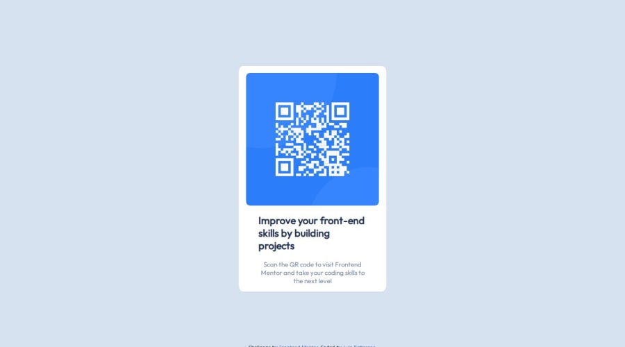
Design comparison
Solution retrospective
I'm proud of how quickly I was able to complete this project.
What challenges did you encounter, and how did you overcome them?Mainly positioning of elements.
What specific areas of your project would you like help with?I would definitely change how I centered the main section to be more dynamic.
Community feedback
- P@danielmrz-devPosted 12 months ago
Hey @Squing0!
Your solution is really impressive!
I've got a couple of ideas (about how to use HTML better) that could make it even stronger:
📌 First: Think about using
<main>to wrap your main content instead of<div>.Imagine
<div>and<span>in HTML as basic containers. They're good for holding stuff, but they don't tell us much about what's inside or its purpose on the webpage.📌 Second: Consider using
<h1>for your main title instead of<h2>.It's more than just text size — it's about structuring your content effectively:
- The
<h1>to<h6>tags are used to define HTML headings. <h1>is for the most important heading.<h6>is for the least important heading.- Stick to just one
<h1>per page – it should be the main title for the whole page. - And don't skip heading levels – start with
<h1>, then use<h2>, and so on.
These tweaks might not change how your page looks, but they'll make your HTML code clearer and help with SEO and accessibility.
Hope that's helpful!
Keep up the great work!
Marked as helpful1 - The
- @R3ygoskiPosted 12 months ago
Hello Lyle, congratulations on completing your project! It's very well done and closely resembles the proposed design.
I noticed that in your footer, there are two
<p>tags with text. They don't need to appear there; you can delete those<p>tags and leave only thediv.attribution.Regarding your alignment approach, it's not incorrect, but you missed using some properties on your body tag, such as
justify-content: center;andalign-items: center, which would help center your card. Then, you can remove themargin: auto;from yourdiv.mainSection.Another tip I'd like to give is about using semantic HTML. Your HTML structure is well done, but it lacks some semantics. For example, your
div.imageContainercould be a<figure>. Semantic HTML like this significantly improves the accessibility of your project.Another tip, but this time regarding CSS, is when working with measurements, spacings, and font sizes. It's strongly recommended to use the rem unit because it can adapt to the user's font settings and provide responsive expansion or contraction of your element.
Again, congratulations on completing this project so closely to the proposed design! Keep practicing and improving. If anything I said isn't clear, please ask below, and I'll try to help as best as I can.
Marked as helpful1@Squing0Posted 12 months agoThank you so much for the detailed feedback! I definitely should have used rem for the sizing of the section and I didn't even think to use the figure tag. Thank you also for the clarification on using flex with the body tag as that is what I was trying to do but couldn't figure out and went with margin: auto; instead.@R3ygoski
1 - @sivaprasath2004Posted 12 months ago
Hello, I would like to extend my congratulations on completing this challenge.
- I will give some suggestion i believe its used for improve your solution result.
- In HTML You will use the following tag
omitthe codes.
<footer class="footerSection">
  `THIS IS SPOILED YOUR SOLUTION

<p>Improve your front-end skills by building projects</p>
  <p>Scan the QR code to visit Frontend Mentor and take your coding skills to the next level</p>

OMIT THIS 2 <p> tag's`
</footer>```
Marked as helpful1
Please log in to post a comment
Log in with GitHubJoin our Discord community
Join thousands of Frontend Mentor community members taking the challenges, sharing resources, helping each other, and chatting about all things front-end!
Join our Discord
