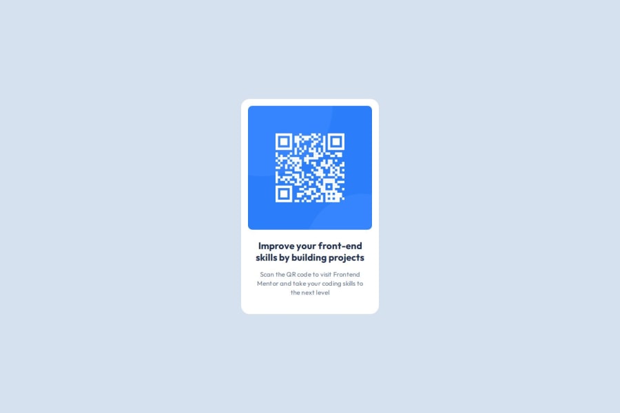
Design comparison
SolutionDesign
Solution retrospective
What are you most proud of, and what would you do differently next time?
Fairly simple project, would probably make the card responsive on screens smaller than 320px (which are pretty rare nowadays)
What challenges did you encounter, and how did you overcome them?No challenges as such.
Community feedback
Please log in to post a comment
Log in with GitHubJoin our Discord community
Join thousands of Frontend Mentor community members taking the challenges, sharing resources, helping each other, and chatting about all things front-end!
Join our Discord
