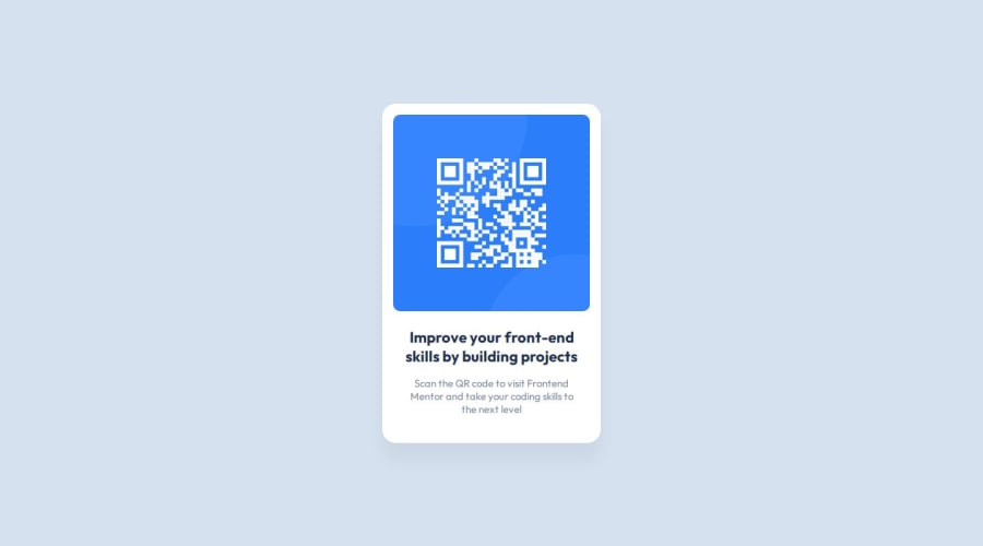
Design comparison
Solution retrospective
I am proud to be able to create the replica of the design. Maybe I could try doing this with Angular since I want to learn it.
What challenges did you encounter, and how did you overcome them?I didn't encounter a challenge so that's good.
What specific areas of your project would you like help with?I would like to see someone add a little creativity to this site :)
Community feedback
- @DarkstarXDDPosted 12 months ago
- Don't use a fixed width for your containers. Use the
max-widthproperty instead of thewidthproperty. When you usewidthit takes away your containers ability to dynamically resize. You can see this issue if you go into your browsers developer tools and resize the screen to smaller screen sizers. Change your.cardto have amax-widthinstead ofwidth. - Remove the
widthon your<div.text>. Since the<div.text>is inside the<div.card>, it will be limited to the max width defined by the<div.card>. If you want the<div.text>to have space around it, use padding. - Also don't use
heighton containers. Let the content inside the container decide the height of the container. So remove theheightproperty from your<div.card> - Your qr code image needs an
altattribute with some descriptive alt text. I would suggest something like "qr code leads to frontendmentor.io". This helps users who navigate the web using screen readers understand what the image is about.
Marked as helpful0@ClatronPosted 12 months agoThank you for your time, I've learned a few things! Also, I applied necessary changes and now it looks a bit better. @DarkstarXDD
0@DarkstarXDDPosted 12 months ago@Clatron Great. But your component is still not properly responsive. There are couple of reasons for that.
- One is you still have a
widthdefined in your<p.description>. Remove that. - Secondly set the width of your image to be
max-width:100%instead of having a fixed width. This will contain your image inside the container (.card, in your case) and will resize when the container gets resized. - One more small tip. I see that you have used
box-sizing: border-box;on your.card. Usually this is applied to all the elements using the*selector. Like below. This is usually included in a CSS reset. You can read about it here.
* {
  box-sizing: border-box;
}
1 - Don't use a fixed width for your containers. Use the
- @lost50U1Posted 12 months ago
you can use an extension called luna paint on vscode to determine the sizes of the padding and margin if you want to make it pixel perfect.
1
Please log in to post a comment
Log in with GitHubJoin our Discord community
Join thousands of Frontend Mentor community members taking the challenges, sharing resources, helping each other, and chatting about all things front-end!
Join our Discord
