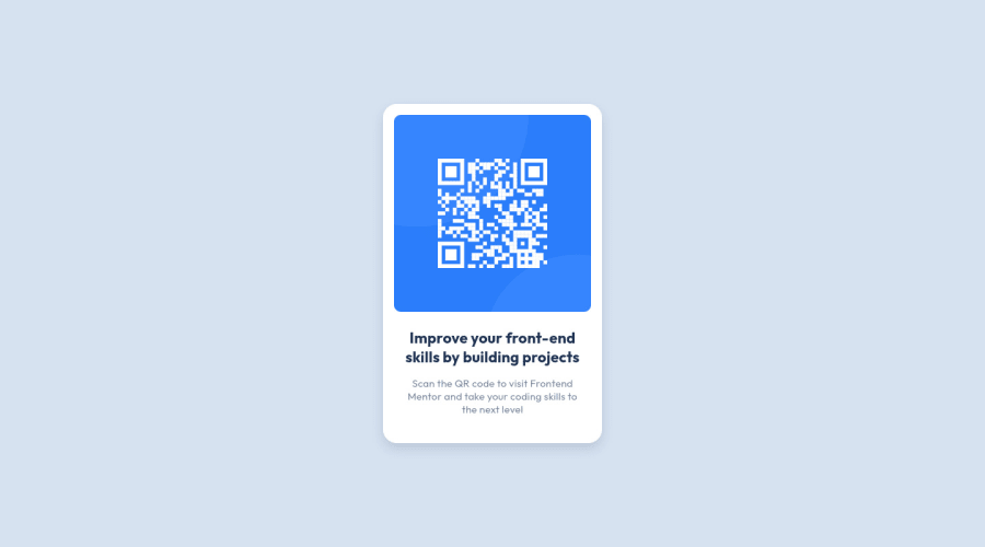
Design comparison
Solution retrospective
Hi all, is there any way to fine tune my solution to closely match the design without having an access to figma/sketch files? Maybe some common letter spacing values or drop shadows throughout the challenges? I don't want to fine tune it to oblivion but small differences are driving me crazy sometimes ;)
Community feedback
- @CornflakesPlusPosted over 2 years ago
Almost Pixeled Perfect solution. Well done Man! 👍✨
1 - @correlucasPosted over 2 years ago
👾Hello @miranlegin, Congratulations on completing this challenge!
You’ve done really good work here putting everything together, I’ve some suggestions to improve the design:
The html structure you've used is working but the code could be cleaner. To make it clean you start by removing some unnecessary
<div>. For this solution you wrap everything inside a single block of content using<div>or<main>(better option for accessibility) and put inside the whole content<img>/<h1>and<p>.YOUR CURRENT CODE:
<body cz-shortcut-listen="true">
    <main>
    <div class="card">
        <img class="card-image" src="images/image-qr-code.png" alt="QR code for Frontend Mentor">
        <h1 class="card-title">Improve your front-end skills by building projects</h1>
        <p class="card-text">Scan the QR code to visit Frontend Mentor and take your coding skills to the next level</p>
    </div>
</main>
</body>
THE CODE CLEANED:
<body>
<main>
<img src="./images/image-qr-code.png" alt="Qr Code Image" >
 <h1>Improve your front-end skills by building projects</h1>
<p>Scan the QR code to visit Frontend Mentor and take your coding skills to the next level</p>
</main>
</body>
2.It's even better to use
relative unitsasremoremthat have a better fit if you want your site more accessible between different screen sizes and devices.REMandEMdoes not just apply to font size, but to all sizes as well.✌️ I hope this helps you and happy coding!
0P@miranleginPosted over 2 years ago@correlucas - Thank you for taking the time and evaluate my exercise.
-
Regarding shortening html tags/classes i can see on other examples that this is common practice right here on the platform and i will take that into consideration for next challenges.
-
I have scrolled thought my repository and only place where i can find px values are in declaring breakpoint variables in scss and using padding-inline on a body element of 28px. Is there something i am missing you are referring to?
Cheers, Miran
1 -
Please log in to post a comment
Log in with GitHubJoin our Discord community
Join thousands of Frontend Mentor community members taking the challenges, sharing resources, helping each other, and chatting about all things front-end!
Join our Discord
