

Design comparison
SolutionDesign

Community feedback
- @py-code314Posted 8 months ago
Hello Abdelkarim,
Great job on the project! I can see that you put in a lot effort creating this. Though I have a few suggestions if you don't mind!
- You might want to add a README file so that others will know about your project with minimum effort
- I noticed that you used normalize.css reset. You could probably remove unnecessary code in the file (for example you don't need
ulandolselectors in there) and combine it with your regular styles.css file - You created a lot of custom properties on
rootselector. Is this necessary for such a small project? This is more of a question than a suggestion 🤔 - I think it's simpler to use flexbox than grid here on
.main-section - You nested the selectors in
.main-section. I'm just curious about it! Is there any added advantage by doing that? - I believe there should be a
text-shadowonh1. Please correct me if I'm wrong!
Marked as helpful0@abdelkarim-el-manssouriPosted 8 months agohello, thank you for your time, here's my humble answers to your questions:
- I always forget to add the readme file 😅, my bad.
- About the normalize.css file, I copy paste it from another project because I was a little busy and preferred to separate it from my main CSS file.
- I always start my projects by setting up everything properly but I didn't do my cleanup at the end, my second bad 😢.
- I prefer to work with Grid than work with Flexbox, it is a matter of personal tastes I think.
- All major modern browsers support it, so why not use it, Plus CSS nesting makes code more organized and readable.
- I don't think there's a text-shadow!
thank you
1 - @saularangurenPosted 8 months ago
Hi friend 👋 , your solution is really great, however, I want to help you improve it with the following tips.
- Start by removing this block of code from your project: The reason is because this code is not necessary.
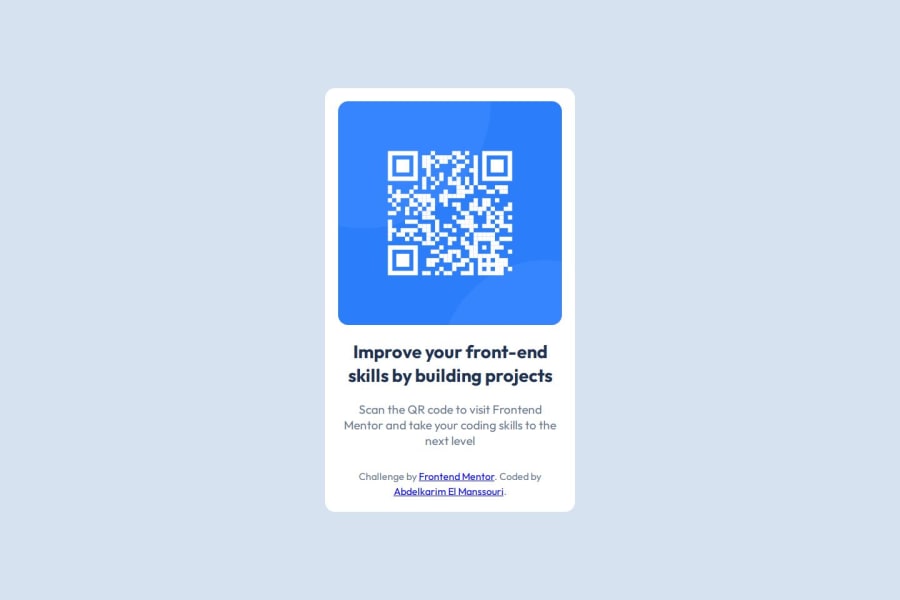
<div class="attribution"> Challenge by <a href="https://www.frontendmentor.io?ref=challenge" target="_blank" >Frontend Mentor</a >. Coded by <a href="https://github.com/abdelkarim-el-manssouri" >Abdelkarim El Manssouri</a > </div>- I advise you not to write your nested CSS rules: They may not be applied in the browser the user is using at the time or there may simply be an error.
.main-section { display: grid; place-content: center; height: 100%; text-align: center; .container { background: var(--clr-accent-100); padding: 1.3rem; border-radius: 1rem; .main-image { border-radius: 1rem; } .main-para { color: var(--clr-primary-500); font-size: var(--fs-650); line-height: 1.3; margin-bottom: 2rem; }- Finally, I encourage you to learn Sass, on YouTube you can find a lot of material that can help you with that and never delete the README.md from your repository, better edit it to your liking and correctly describe your project.
Links:
happy coding 😁
Marked as helpful0@abdelkarim-el-manssouriPosted 8 months ago@saularanguren Thank you for your advice i appreciate it
1


Please log in to post a comment
Log in with GitHubJoin our Discord community
Join thousands of Frontend Mentor community members taking the challenges, sharing resources, helping each other, and chatting about all things front-end!
Join our Discord