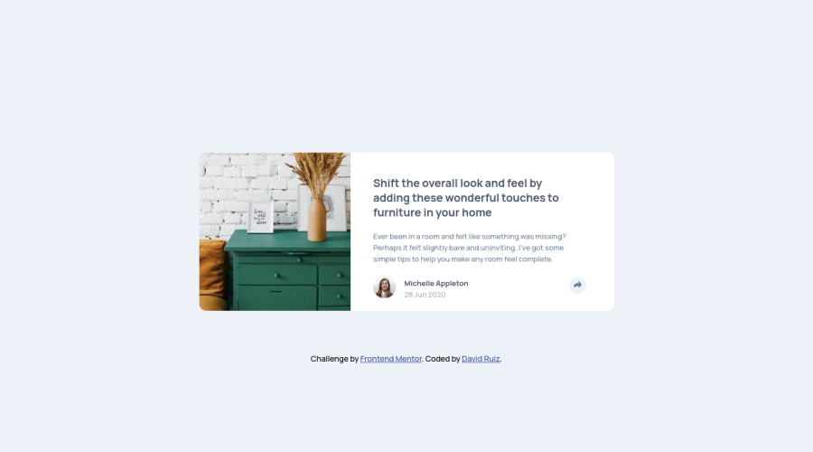
Design comparison
Solution retrospective
Simple product card using HTML and CSS Any feedback is welcome!
Community feedback
- @ApplePieGiraffePosted almost 3 years ago
Hi there, CodingTube! 👋
Good work on this challenge! 👍 Your solution looks great and is responsive! 👏
There's not too much I can suggest, but it may be worth using the
gapproperty from grid or flexbox a little more in your layouts to add space between elements. That way, you won't have to add margin to each individual element and adding consistent spacing between elements will be much easier.Don't forget that you can use padding to add space inside of elements, too. A good place to do that would be the inside of the container that holds the text content of this card (rather than, once again, using margin on individual elements do accomplish that). 😉
Hope you find these tips helpful. 😊
Keep coding (and happy coding, too)! 😁
2 - @CodinGitHubPosted almost 3 years ago
Thank you very much for your feedback! I decide to use margin to every single element because if I use padding in the card container the image doesn't fit to the 100% of the width of the card and I don't like to use position absolute to do that. Do you know another way to achieve the image use all the width of the container even if the container have a padding?
1
Please log in to post a comment
Log in with GitHubJoin our Discord community
Join thousands of Frontend Mentor community members taking the challenges, sharing resources, helping each other, and chatting about all things front-end!
Join our Discord
