
Design comparison

Solution retrospective
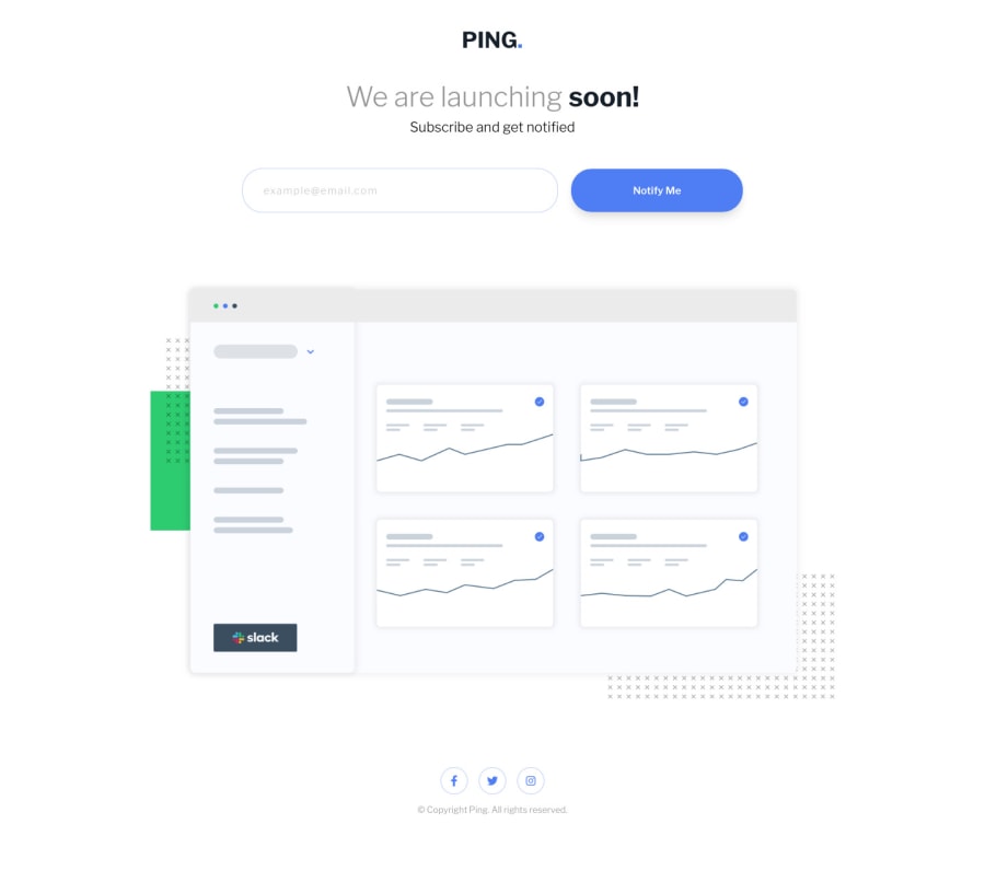
Hello 👋
I tried to rush it in 20 minutes 🚀
Please, hit me with your best advices on how to improve it 🌱
Community feedback
- @grmbyrnPosted about 3 years ago
Really good job, especially if it only took 20 minutes!
I noticed that at the smallest screen size 'We are launching soon' moves over to touch the left side. Also, when I don't enter an email address on mobile, the email address box moves to the left while Notify Me seems to grow longer. But great stuff overall! 👍
Marked as helpful1@jgengo-altPosted about 3 years agoHello Graeme Byrne!
Thank you for your feedback! I didn't manage to replicate the issue from Chrome, could you please share with me your environment (OS + Browser) ?
Thank you in advance! 🪴
0@grmbyrnPosted about 3 years ago@jgengo-alt I'm inspecting it on Chrome using macOS High Sierra, if that helps. It pulls to the left from Mobile S - 320px until Mobile L - 425px.
0@jgengo-altPosted about 3 years ago@grmbyrn That was a very good catch from you!
Thanks again! it's fixed now! 💪
0@grmbyrnPosted about 3 years ago@jgengo-alt No worries, Jordane! Feel free to mark it helpful if it helped you.👍
0

Please log in to post a comment
Log in with GitHubJoin our Discord community
Join thousands of Frontend Mentor community members taking the challenges, sharing resources, helping each other, and chatting about all things front-end!
Join our Discord