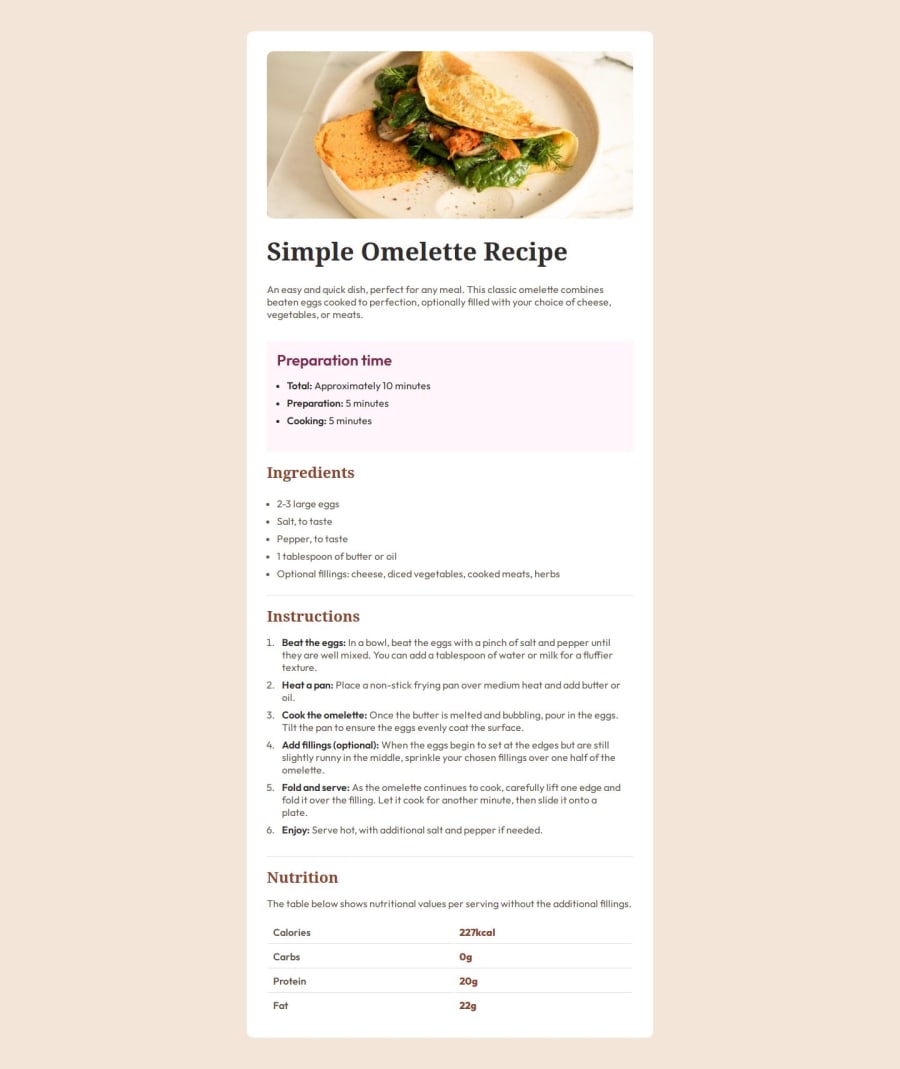
Simple Omelette Recipe Page Using HTML and CSS
Design comparison
Solution retrospective
I'm most proud of how I structured the recipe page, including the layout and styling of the various sections.
What challenges did you encounter, and how did you overcome them?One challenge I encountered was styling the nutrition table to align properly within its container. I overcame this challenge by using CSS properties like padding, margin, and border to adjust the layout and spacing.
What specific areas of your project would you like help with?I would appreciate feedback on the overall design and usability of the recipe page.
Community feedback
- @Lbaranda26Posted 12 months ago
Excellent!
You need a little bit of adjustment in the margin, color and padding.
For sample in the list, to adjust it you need to style it like li{padding-left: 8px;} li::marker{color: brandyred;}
Overall this is great, keep up to good work!
Marked as helpful0@kanchan-git-projectsPosted 12 months ago@Lbaranda26 Thank you so much for reviewing my work.
0
Please log in to post a comment
Log in with GitHubJoin our Discord community
Join thousands of Frontend Mentor community members taking the challenges, sharing resources, helping each other, and chatting about all things front-end!
Join our Discord
