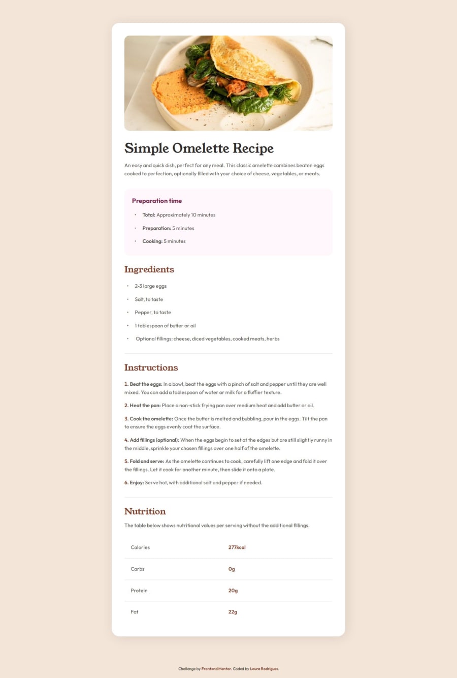
Design comparison
Solution retrospective
I am most proud of successfully laying out the page using simple commands. I didn’t face many difficulties in organizing the information with the knowledge I already have. For the future, I plan to continue learning about spacing and best practices for organizing information to avoid cluttered code.
What challenges did you encounter, and how did you overcome them?I encountered a challenge when trying to design a table aligned horizontally, which was something new for me despite its simplicity. To overcome this barrier, I revisited my notes and watched tutorials on Flexbox, which helped me gain the understanding needed to tackle the problem effectively.
What specific areas of your project would you like help with?I would appreciate help with some specific areas of my project, particularly with spacing and alignment. I sometimes struggle with deciding when to use Flexbox versus Grid. I also feel uncertain about my choices of measurement units and best practices for responsiveness and accessibility. I would like to understand better when to use different units and how to make a container behave differently on various screen sizes.
Community feedback
Please log in to post a comment
Log in with GitHubJoin our Discord community
Join thousands of Frontend Mentor community members taking the challenges, sharing resources, helping each other, and chatting about all things front-end!
Join our Discord
