Submitted over 1 year agoA solution to the Recipe page challenge
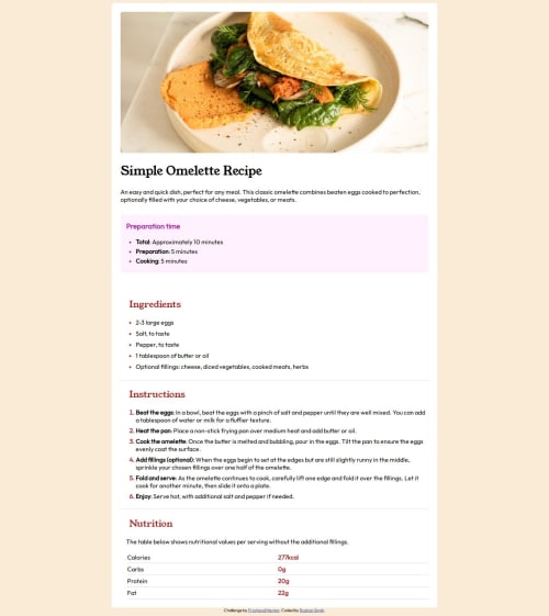
Simple Omelette Recipe Challenge
@rshnsgh

Solution retrospective
What are you most proud of, and what would you do differently next time?
I'm most proud of my ability to sort and organize everything given that this is my first time attempting a project of such.
What challenges did you encounter, and how did you overcome them?The two main challenges i encountered was the nutrition table and the mobile vie that changes with size. I overcame both by a simple google search that showed me how close I was to getting it right without having to do research.
What specific areas of your project would you like help with?I would say mainly the CSS
Code
Loading...
Please log in to post a comment
Log in with GitHubCommunity feedback
No feedback yet. Be the first to give feedback on rshnsgh's solution.
Join our Discord community
Join thousands of Frontend Mentor community members taking the challenges, sharing resources, helping each other, and chatting about all things front-end!
Join our Discord