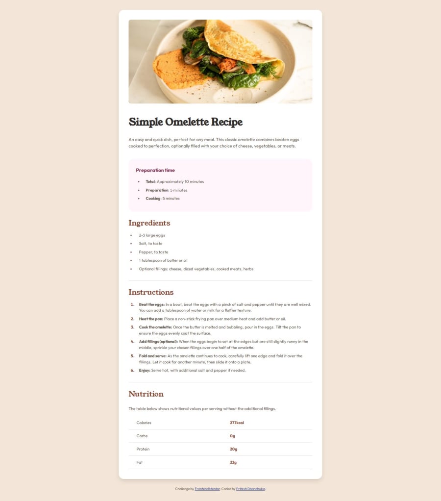
Design comparison
Solution retrospective
I am most proud of the attention to detail and the level of care I put into ensuring that the project meets the design specifications and follows best practices for web development. From the semantic HTML structure to the well-organized CSS styles, I aimed to create a codebase that is not only visually appealing but also maintainable and accessible. If I were to approach a similar project in the future, I would consider using a CSS preprocessor like Sass or Less to organize and modularize my styles more effectively. This would allow for better code reusability, easier maintenance, and the ability to take advantage of advanced features like variables, mixins, and nesting. Additionally, while I focused on responsive design principles in this project, I would explore implementing a mobile-first approach more intentionally. This methodology encourages designing and building for the smallest screens first, progressively enhancing the experience as the viewport size increases, which can lead to better performance and a more optimized user experience across devices.
What challenges did you encounter, and how did you overcome them?One of the challenges I encountered was ensuring that the layout remained consistent and visually appealing across different screen sizes. To overcome this, I utilized CSS techniques such as flexible box layouts, relative units, and media queries to create a responsive design that adapts to various viewport widths. Another challenge was interpreting the provided design mockup and translating it into code accurately. To address this, I carefully studied the design specifications, paying close attention to details such as typography, spacing, colors, and layout. I also made use of developer tools in the browser to inspect and adjust the styling as needed. Additionally, I encountered some challenges related to accessibility considerations. To overcome these, I ensured that semantic HTML elements were used appropriately, provided alternative text for images, and maintained proper heading hierarchy and focus order. I also consulted accessibility guidelines and best practices to ensure that the project meets accessibility standards.
What specific areas of your project would you like help with?While I am confident in my HTML and CSS skills, there are always opportunities for improvement and learning. Specifically, I would appreciate guidance and feedback in the following areas:
Performance Optimization: I am interested in learning more about techniques and strategies for optimizing the performance of web pages, such as minimizing render-blocking resources, optimizing asset delivery, and implementing performance budgets. Accessibility Testing: Although I followed accessibility best practices, I would benefit from hands-on experience with accessibility testing tools and methodologies. This would help me identify and address potential accessibility issues more effectively. CSS Architecture and Scalability: As projects grow in complexity, maintaining and scaling CSS can become challenging. I would welcome recommendations on CSS architecture patterns, such as BEM, SMACSS, or CSS Modules, to improve code organization and scalability. Cross-browser Compatibility: While I tested the project across different browsers, I would appreciate guidance on best practices for ensuring consistent cross-browser behavior, especially when it comes to handling browser-specific quirks or implementing fallbacks for older browsers.
By receiving feedback and guidance in these areas, I can continue to improve my skills and deliver even more robust and efficient front-end solutions in the future.
Community feedback
Please log in to post a comment
Log in with GitHubJoin our Discord community
Join thousands of Frontend Mentor community members taking the challenges, sharing resources, helping each other, and chatting about all things front-end!
Join our Discord
