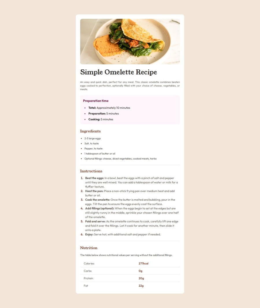
Design comparison
Community feedback
- @AdrienneAEWPosted about 1 month ago
Wonderful job. I wish I could us json as well as you have. I see you didn't use the font-variant property for list markers, it was a sticking point for me. It's hardly noticeable that the number list font-face is different from the body's font-face. Any hoo, it's so minor I don't know why I mention it aside from the fact that it stuck in claw.
You've used a number of frame works and libraries which added to the difficulty of the challenge. It shows you are quite skilled at coding. And you've inspired me to up my game in a re-do of this challenge for my portfolio where I will attempting to use some of the techniques you employed here.
Great job.
Marked as helpful1@herojk64Posted 29 days ago@AdrienneAEW Thanks for the compliment. When we code in hurry we miss few minor details as we go. but in development we re-evaluate so minor mistakes like the one you mentioned are mostly fixed during that phase so no big deal.
0
Please log in to post a comment
Log in with GitHubJoin our Discord community
Join thousands of Frontend Mentor community members taking the challenges, sharing resources, helping each other, and chatting about all things front-end!
Join our Discord
