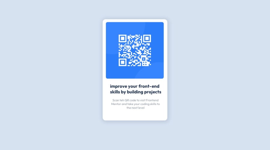
Design comparison
Community feedback
- @Kamlesh0007Posted over 1 year ago
Congratulations on completing the challenge! That's a great achievement, and I'm sure you put a lot of effort into it. I really liked the way you approached the challenge and the code you wrote. You demonstrated a good understanding of the concepts and applied them effectively to solve the problem.I have a few suggestions to improve your code further.
Flexbox is a CSS layout model that offers a simple and intuitive way to center elements. Compared to using positioning, flexbox provides the following benefits:
1.It requires less code and is easier to understand and implement.
2.It automatically adjusts centering as the container size changes, making it ideal for responsive designs.
3.It has a property specifically for vertically aligning items, eliminating the need for complex calculations.
4.It handles dynamic content, such as varying text lengths, without requiring manual adjustments.
so u can add below code to make container center using flexbox
body {
background-color: hsl(212, 45%, 89%);
margin: 0;
font-family: 'Outfit', sans-serif;
display: flex;
justify-content: center;
align-items: center;
min-height: 100vh;
}
now remove below styles
.card {
position: relative;
left: 50%;
top: 50%;
transform: translate(-50%, 19%);
}
Marked as helpful0
Please log in to post a comment
Log in with GitHubJoin our Discord community
Join thousands of Frontend Mentor community members taking the challenges, sharing resources, helping each other, and chatting about all things front-end!
Join our Discord
