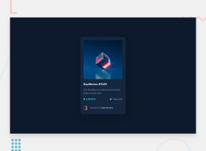
Design comparison
Community feedback
- @FabianthorsenPosted over 1 year ago
Great solution, and good attention to detail. Here are som points that I noticed when looking at your code:
CSS
When you're using css pre-processing frameworks such as SCSS there are so many cool things you can do, one thing you're doing now is:
  .image-div img {
    max-width: 100%;
    border-radius: 15px;
  }
while you could reference the parent with
&making it:& img { max-width: 100%; border-radius: 15px; }You can do this when you're using pseudo-selectors like
&:hoverand much more as well.HTML
Try using semantic-html instead of only relying on
divfor everything, this can improve SEO and accessibility. Read more on sematic HTML hereDesign
Lastly just a quick tip in terms of design, your font as it is not in some places, is really difficult to read as it is both thin and small at the same time. Try to emphasise areas of importance by making them bold and maybe increase their fonts a little, or changing the colour is also a good alternative.
Marked as helpful0@kakuhdPosted over 1 year ago@Fabianthorsen Thanks for great feedback!
- CSS: I added & for hover pseudo classes in .scss file
- HTML: I kept accessibility in mind when I was doing this challenge but couldn't come up with a more semantic approach. I added aria-hidden=true and also used h2 and p to correctly prioritize text order.
- Design: Hmm, to me the font-size seems fine and I played with it a bit to make sure it's readable. I think I just need to implement more designs and will get a better eye for details over time
1
Please log in to post a comment
Log in with GitHubJoin our Discord community
Join thousands of Frontend Mentor community members taking the challenges, sharing resources, helping each other, and chatting about all things front-end!
Join our Discord
