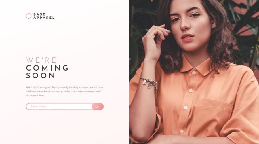
Design comparison
SolutionDesign
Solution retrospective
What did you find difficult while building the project? At first, I found it difficult how to make the transition between the desktop and mobile layouts, so I figured out that I needed to use the grid, it was a great learning opportunity.
Which areas of your code are you unsure of? The responsiveness, I'm not sure I did a good job with the images and following good practices.
Do you have any questions about best practices? I would like to know a good way to approach this website.
Community feedback
Please log in to post a comment
Log in with GitHubJoin our Discord community
Join thousands of Frontend Mentor community members taking the challenges, sharing resources, helping each other, and chatting about all things front-end!
Join our Discord
