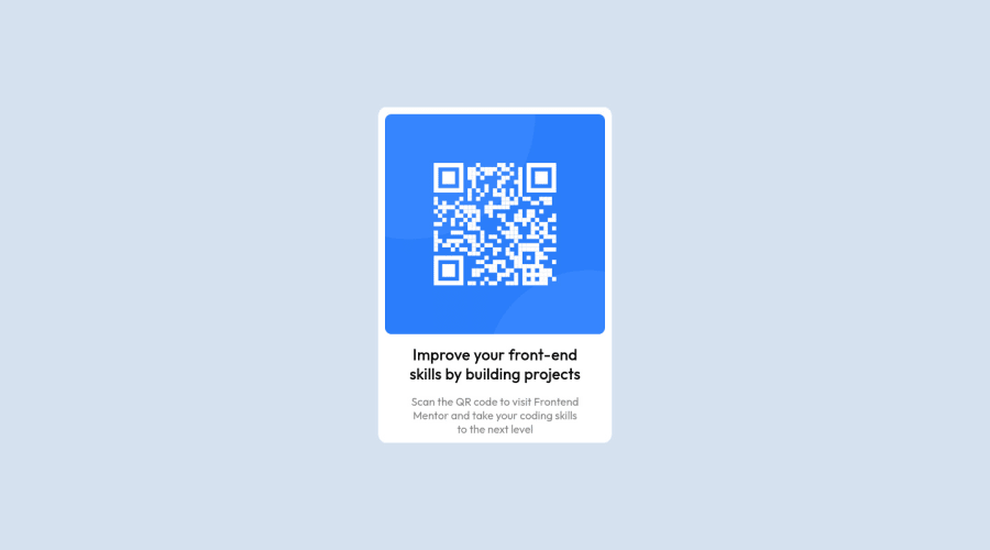
Design comparison
SolutionDesign
Community feedback
- @denieldenPosted about 2 years ago
Hi Ngmaibulat, congratulations on completing the challenge, great job! 😁
Some little tips for optimizing your code:
- add
maintag and wrap the card for improve the Accessibility - also you can use
articletag instead of a simpledivto the container card for improve the Accessibility - add descriptive text in the
altattribute of the images - use
h1tag for the title of card and notdivwith class - use
ptag for the text of card and not aspan - centering a
divwithabsolutepositioning is now deprecated, it uses modern css likeflexbox or grid - use flexbox to the body to center the card. Read here -> best flex guide
- after, add
min-height: 100vhto body because Flexbox aligns child items to the size of the parent container - instead of using
pxuse relative units of measurement likerem-> read here
Hope this help! Happy coding 😉
Marked as helpful0 - add
Please log in to post a comment
Log in with GitHubJoin our Discord community
Join thousands of Frontend Mentor community members taking the challenges, sharing resources, helping each other, and chatting about all things front-end!
Join our Discord
