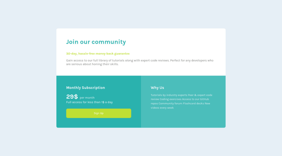
Design comparison
SolutionDesign
Solution retrospective
Any feedback is appreciated.
Community feedback
- @Dharmik48Posted about 3 years ago
Hey👋,
Great Job with the solution! It looks really good! Just a couple of issues I found:
- You have add a class of
containerto themainelement, and I think it is not necessary as there will be only onemainelement on the page so you don't need a class to identify it. - Also try to add
hovereffect withtransitionto the sign up button to increase the experience.
Keep Developing👍.
Marked as helpful0 - You have add a class of
Please log in to post a comment
Log in with GitHubJoin our Discord community
Join thousands of Frontend Mentor community members taking the challenges, sharing resources, helping each other, and chatting about all things front-end!
Join our Discord
