Design comparison
SolutionDesign
Community feedback
- @carlosarturoleonPosted about 2 months ago
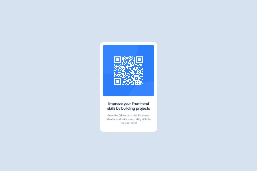
Excellent, just one thing the card has a fixed width of 288px, which might not be ideal for tiny screens. Consider using max-width instead of a fixed width for better adaptability.
0
Please log in to post a comment
Log in with GitHubJoin our Discord community
Join thousands of Frontend Mentor community members taking the challenges, sharing resources, helping each other, and chatting about all things front-end!
Join our Discord
