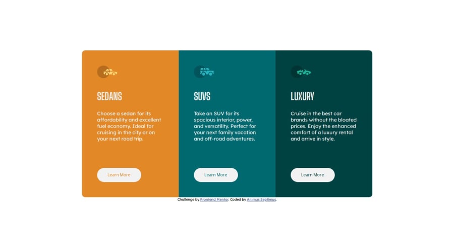
Design comparison
SolutionDesign
Solution retrospective
I have a gap when it is 2 card in row. How can i avoid it?
Community feedback
- @addiellucena94Posted about 1 year ago
Good job, only one suggestion, fix the font color and put the car brands in capital letters.
You can try to use:
color: white;
text-transform: capitalize;
1
Please log in to post a comment
Log in with GitHubJoin our Discord community
Join thousands of Frontend Mentor community members taking the challenges, sharing resources, helping each other, and chatting about all things front-end!
Join our Discord
