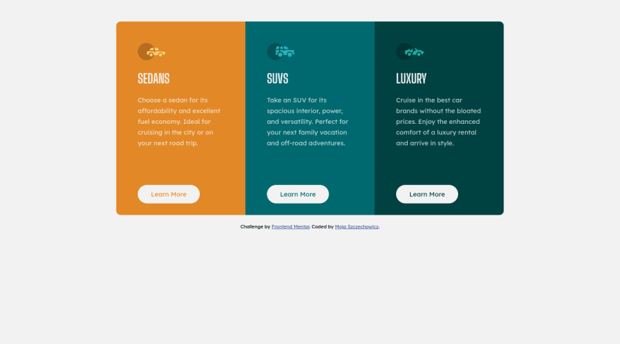
Design comparison
Solution retrospective
This is my first project and I would need a feedback because I don't even know what to ask. I'm learning how to code by myself from 2 months.
What mistakes did I made? What could I have done better? What should I be careful about in such design? How would you rate my code from 1 to 10? ;)
Thank you for your help and support :D
Community feedback
- @DrKlonkPosted over 3 years ago
Hi Maja,
I agree with the others that CSS Flexbox is a great way to accomplish flexible layouts. I'd like to add Flexbox Froggy as an additional resource to practice with it!
Happy coding!
Cheers, Joran
0@MSorJinxiPosted over 3 years agoHi Jordan! Thank you for feedback! Flexbox froggy will be really helpful :) Maja
0 - @tedikoPosted over 3 years ago
Hello, Maja Szczechowicz! 👋
Congrats on finishing your first challenge! Your solution looks very good and also responds well. Here's my few tips:
- Read about semantic. Semantic elements lead to more consistent code, they are easier to read and improve accessibility.
- Instead of using
float
s read about flexbox and its possibilities.Flexbox
provides a more efficient way to lay out your web components, align and distribute space among items in a container, even when their size is unknown and/or dynamic. - Change the
alt
attributes for the icons, as they don't add any extra context for screen reader users. Since your images are decorative youralt
text should be provided empty (alt="") so that they can be ignored by assistive technologies. - Try to work on the proper class naming. Your classes aren't descriptive and also hard to read in the code. One of many benefits of proper class naming is that you know what to expect from a certain class without looking at code, even if you aren’t the person who created it or if it was written a long time ago. The name of a selector should be self-descriptive and readable. For example instead of
.rectangle
you can name it.container
. Good luck with that, have fun coding! 💪
0@MSorJinxiPosted over 3 years ago@tediko thank you for your feedback. I will definitely read about the semantic and flexbox more. I didn't know that it is fine to leave the alt empty, so big thanks for that comment. And for sure I will practise the naming. I definitely felt that I have problem with this while I was writing this code. Could you tell me how you would name this class in my code? Thank you!
0@tedikoPosted over 3 years ago@MSorJinxi Are you on frontendmentor slack? It would be easier. For example
.rectangle
can be your.card-container
and then your.auto-type
to keep the same terminology can be name simply a.card
. It isn't really something I can show you, you just have to think about classes to make them as descriptive as you can, so when you back to code later on you don't waste time on understanding what these classes mean.0 - @Shomy032Posted over 3 years ago
1 . Your cards are not centered vertically on desktop view , solution : use flexbox or grid insted of float , that way you can do it easily , ( Floats work really well in small cases like when there's an element, such as a button, that you'd like to move to the right of a paragraph. But the real issue arises when you start using floats to lay out entire web pages. And the reason for that is: floats are not meant for layouts , instead use flexbox or grid)
2 . Maybe you can add property ' transition ' on your buttons , so when you hover them color change smoothly ( for example : transition : all 300ms linear ; ),
- you can add tagret="_blank" , on your link to github , so its open on new page.
helpful links for research :
Anyway great work , if you have any more questions feel free to ask , and keep up coding :)
0@MSorJinxiPosted over 3 years ago@Shomy032 thank you so much for your suggestions :) Yes I need to practise a little more the flexbox and grid solutions in my next projects. For now it was the easiest way to just try to code. And true I need to pay attention to this little things like transition! I will make this adjustments to remember them :D Than you! I will keep practise
0
Please log in to post a comment
Log in with GitHubJoin our Discord community
Join thousands of Frontend Mentor community members taking the challenges, sharing resources, helping each other, and chatting about all things front-end!
Join our Discord