Not Found
Not Found
Not Found
Not Found
Not Found
Not Found
Not Found
Not Found
Not Found
Not Found
Not Found
Not Found
Not Found
Not Found
Not Found
Not Found
Not Found
Not Found
Not Found
Not Found

Submitted

Simple Flexbox solution of this QR project!

Alan Torinoβ€’ 60

@Alan08t

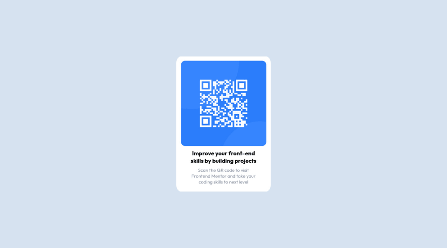
Desktop design screenshot for the QR code component coding challenge

This is a solution for...

  • HTML
  • CSS
1newbie
View challenge

Design comparison


SolutionDesign

Solution retrospective


Hello everyone!

In this, my first project presented on this platform, I have decided to choose the first project that the platform provides us with.

So while the design is very simple, that doesn't stop me from practicing my flexbox skills, I'm very surprised at how much we can save on code with more practice.

It's amazing!

Well, for me it is a pleasure if you, dear community of this beautiful profession, can give me your opinion to learn more and more!! Thanks for reading me and my horrible English πŸ˜…πŸ˜….

Community feedback

@RichardOgujawa

Posted

Hi Alan!

Great job with the code, love what you've done man. Just had a few recommendations but feel free to disagree.

In the HTML:

  • Get into the practice of wrapping the main content of your project with the main tag, even if it's the only piece of content on the page.
  • I know that more than likely the heading in this component wouldn't be a h1 level heading if it was included in a website, but given that it's the only content on the page it should be regarded as the main heading on the page, and therefore does deserve to be written using a h1. The h1 is simply for the most important text on the page, the introduction, and what is the page about. Every page should have one. h2, h3, etc. are for headings of lesser importance, and for them to be of lesser importance, there must first be a heading of greater importance. If the h1 tag appears to be inappropriate it's probably because of its appearance, but don't let appearance prevent you from making your HTML as semantic as possible. You can always fix the appearance later with the CSS.
  • I'd recommend looking into the BEM Naming Convention for classes. It makes it easier to write classes for you as a developer, and easier for other developers to understand your code (https://codeburst.io/understanding-css-bem-naming-convention-a8cca116d252)
  • I'd recommend using the picture tag, it's better than just using the img tag. More on that here: https://blog.bitsrc.io/why-you-should-use-picture-tag-instead-of-img-tag-b9841e86bf8b

In the CSS:

  • I like how you've separated the different properties in your CSS based on what they do, for example how you have the display properties separate from the dimension properties separate from the color properties, etc. It makes the code a lot easier to read. However, I would recommend putting anything that has to do with the dimension of the elements in the same group though, for example, instead of separating width from padding, I'd put them in the same group, because they all contribute to the overall size of the element. Things like a margins, and borders also contribute to the overall size o an element. I also include font-size when I write my CSS, but it's a bit more debatable I guess.
  • I'd recommend using em and rem units. Em units for things like padding, margins, border, etc. and rem units for fonts. They are both linked to the font sizes you use so with this method you can easily adjust the size of a lot of things on your page simply by adjusting the font-size in the html selector. Also because em is linked to the font-size, you don't have to scale up buttons if you increase the font-size, it'll do so automatically.

Hope this helps, and sorry for any typos if there are any:)

Marked as helpful

1
Luz De La Rosaβ€’ 100

@luztherose

Posted

Hi Alan πŸ‘‹πŸΎ

Congratulations on completing this challenge. Your solution looks great. I have some suggestions regarding your solution if you don’t mind:

I suggest that you keep all your CSS in one place. It's great that you have your external stylesheet, so you could move the styles that you have in the index.html to your stylesheet.

For better accessibility, try to use semantic elements whenever possible. For instance, the <div class="container"> could be replaced with the main tag, <main class="container"> , and this <div class="attribution"> could be <footer class="attribution">

Overall Excellent work! Hopefully, this feedback helps.

Marked as helpful

1

Please log in to post a comment

Log in with GitHub
Discord logo

Join our Discord community

Join thousands of Frontend Mentor community members taking the challenges, sharing resources, helping each other, and chatting about all things front-end!

Join our Discord