Design comparison
SolutionDesign
Solution retrospective
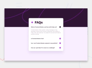
no big issue, just wondering why i can't position my background img
Community feedback
- @danielmrz-devPosted 10 months ago
Hello @DicksenT!
Your solution is awesome!
Loved the font-size transition when I click on the question! 😁
I have a couple of suggestions:
-
Since the question and the plus/minus button are clickable elements, it's nice to add
cursor: pointerto them. -
Also, you can add
background-color: #FAEEFF;with thebackground-imagetogether, they will complement each other to create the pattern in the design.
Other than those details, you did an excellent job!
Hope it helps!
Marked as helpful1@DicksenTPosted 10 months ago@danielmrz-dev thanks for the compliment and suggestion!
0 -
Please log in to post a comment
Log in with GitHubJoin our Discord community
Join thousands of Frontend Mentor community members taking the challenges, sharing resources, helping each other, and chatting about all things front-end!
Join our Discord
