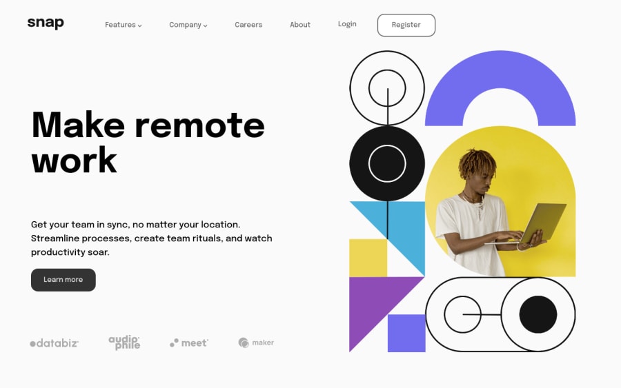
Design comparison
Solution retrospective
Like any project that i do i always start of great with the HTML and CSS but the moment i start thinking about responsive design i crumble like a cookie.
When writing the HTML i see the design preview and play out the layout in my head with how i would place the divs and sections to accomodate the content but once i start going from mobile to desktop i start doubting my decisions and start thinking "ohh maybe i should've added a div there, but then if i add it there i need to rework the mobile version" etc. So i need to get better at planning the HTML for both mobile and desktop, but i guess this is something il get better with time.
Community feedback
- @DavidMorgadePosted over 2 years ago
Hi! congrats on finishing the challenge!
Regarding your issue, a general approach that I usually take is to look at the 3 designs (mobile, tablet and desktop), and then try to get a general structure, doing mobile first as you do is usually the best approach, but maybe you need to add that
div
for the desktop version even if you are starting at mobile!.Other way is to get the desired result with CSS, you can get the structure changing your CSS, for example instead of using
flex
usinggrid
, other directions offlex-direction
align-items
orjustify-content
.Hope my answer helps you!
Marked as helpful0 - @pradeeps4iniPosted over 2 years ago
Hello, @DrRuski.
Like any project that i do i always start of great with the HTML and CSS but the moment i start thinking about responsive design i crumble like a cookie.
To make it responsive think in terms of semantic structure and blocks. Analyze your design and see what moves in the transition between desktop to mobile and vice versa. For example: In the design of this project, there are two main transitions happening. First the hero image moves from left to the top and second the navigation in header turns into a drop down menu. Plan your page from these cues.
You could structure your page like this:
<body> <header> <img src="logo"> <nav> <div class="left-part"> </div> <div class="right-part"> </div> </nav> </header> <main> <section class="content"> </section> <picture class="hero-img"> </picture> </main> </body>
-
You can use <picture> element to change the different size image respective to the width of the viewport. You won't have to rely on CSS and media queries. It keeps the code simple and readable.
-
You can create utility classes to not repeat your CSS. For example: you can create a flex class which you can use on element where you want to use flexbox.
.flex { display: flex; }
Marked as helpful0 -
Please log in to post a comment
Log in with GitHubJoin our Discord community
Join thousands of Frontend Mentor community members taking the challenges, sharing resources, helping each other, and chatting about all things front-end!
Join our Discord