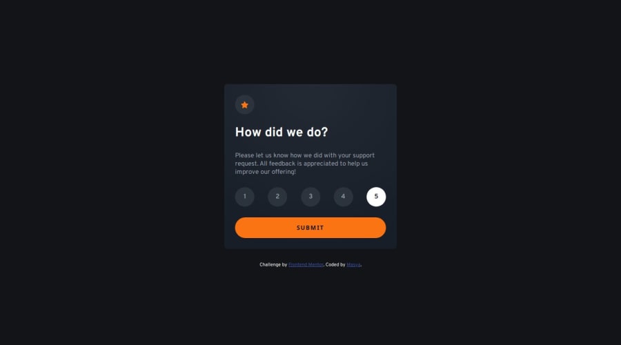
Design comparison
Community feedback
- @BunchydoPosted about 2 months ago
Semantic HTML: You're using a good structure with a mix of div elements, but it could benefit from more semantic HTML tags. For example: Consider using a <section> tag for the rating card and thank-you card. This will better convey the meaning of those sections in the document. A <main> tag around the core content would improve the structure and semantics of the page.
Accessibility: Radio Inputs: You're hiding the radio inputs, which is a good strategy for custom styling, but make sure to ensure accessibility by associating a label for each input, which you've done correctly. Adding aria-label attributes or aria-checked for custom elements might improve accessibility further. Focus States: Ensure that when a user focuses on the radio buttons or the submit button, there is a visual indication. This can be done through CSS, e.g., :focus state styling for these elements.
Layout Responsiveness: You're using max-width for both .rating-card and .thanks-card, which is a good approach for maintaining responsiveness. It ensures that your layout adapts well across different screen sizes. Consider adding some padding or margins to adjust for very small or large screens. You might also want to use media queries for finer control over smaller devices.
0
Please log in to post a comment
Log in with GitHubJoin our Discord community
Join thousands of Frontend Mentor community members taking the challenges, sharing resources, helping each other, and chatting about all things front-end!
Join our Discord
