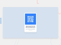
Design comparison
SolutionDesign
Solution retrospective
Please check the margin and paddings. Thanks
Community feedback
- @AdrianoEscarabotePosted about 2 years ago
Hi Yojan kaphle, how are you?
I really liked the result of your project, but I have some tips that I think you will enjoy:
- every Html document must contain the main tag, so we can identify the main content, to fix this, wrap all the content with the main tag. HTML5 landmark elements are used to improve navigation experience on your site for users of assistive technology.
- To align some content in the center of the screen, always prefer to use
display: flex;it will make the layout more responsive!
Example:
body {
    margin: 0;
    padding: 0;
    display: flex;
    align-items: center;
    justify-content: center;
    min-height: 100vh;
}
The rest is great!
I hope it helps... 👍
0 - @to-my-learning-pathPosted about 2 years ago
Flex will help centering the content. For example in your body class, add this:
.body {
    width: 21%;
    background-color: hsl(0, 0%, 100%);
    padding: 1rem;
    border-radius: 5%;

    display: flex;
    justify-content: center;
    align-items: center;
    flex-direction: column;
}
Now you can apply the same to body element to center the whole card div.
0
Please log in to post a comment
Log in with GitHubJoin our Discord community
Join thousands of Frontend Mentor community members taking the challenges, sharing resources, helping each other, and chatting about all things front-end!
Join our Discord

