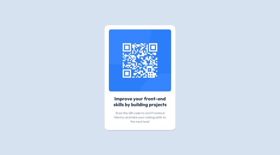
Simple CSS QR-code component
Design comparison
Solution retrospective
My new solution. I hope I structured the html and used flexbox correctly. Any suggestion is welcome!
Community feedback
- @irenanrodriguesPosted over 1 year ago
Olá Pamella, tudo bem? Ao meu entendimento está tudo certo. Parabéns novamente.
Recomendo não usar height na classe main-container, use o min-height, para alcançar a altura desejada.
Apenas com o height, você está definindo uma altura fixa, para seu elemento. Faça um teste com o DevTools, para ver as diferenças.
Marked as helpful0@PamellaoliveiracontePosted over 1 year agoValeu pelas dicas @irenanrodrigues!
0 - @Mennatallah-HishamPosted over 1 year ago
Hi Pamella,
Congratulations on completing your first challenge👏
You did great 👍
Here are some suggestions to improve your code:
Semantic HTML
- wrap your card in <article>
<main>
<article>
</article>
<div>
</div>
</main>
ALT
- images should have descriptive alt text, which is important for SEO and screen reader users,alt="QR code linking to Frontend Mentor challenges"
SEO
- you can add meta description for better SEO, it provides a brief summary of a web page
<meta name="description" content="..........."/>here are some helpful articles:
Hope you find this helpful, Happy Coding
Marked as helpful0
Please log in to post a comment
Log in with GitHubJoin our Discord community
Join thousands of Frontend Mentor community members taking the challenges, sharing resources, helping each other, and chatting about all things front-end!
Join our Discord
