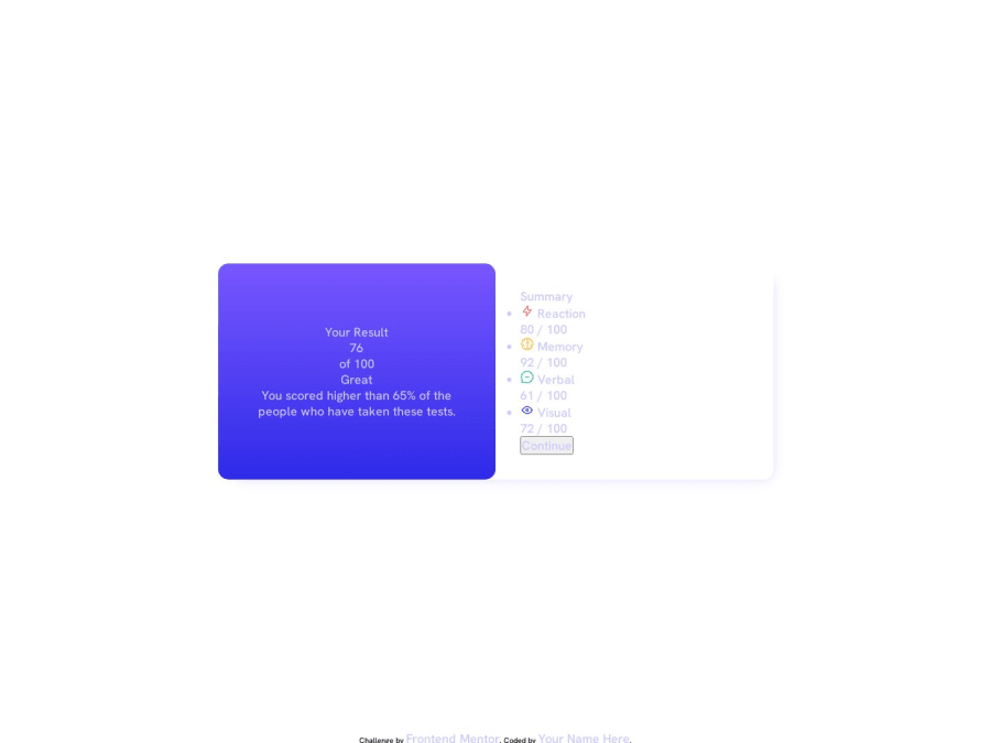
Design comparison
Community feedback
- @Abhishekshah007Posted over 1 year ago
It is certainly positive that you are trying, but unfortunately, you can see for yourself that your work does not match the output as we assumed. We kindly request you to update your code and strive to achieve the desired results. We are not expecting an exact match, but we do anticipate results within the range of 90 to 95 percent.
#AllTheBest
Marked as helpful1@HauroEnojadoPosted over 1 year ago@Abhishekshah007 The truth is, it works as specified in the challenge, but it doesn't load the screenshot correctly, or maybe I need more theory to understand what's wrong. I'm using CSS nesting and Netlify to display the solution.
I'm sorry if I didn't translate what I want to express correctly, I'm just starting to learn English.
1
Please log in to post a comment
Log in with GitHubJoin our Discord community
Join thousands of Frontend Mentor community members taking the challenges, sharing resources, helping each other, and chatting about all things front-end!
Join our Discord
