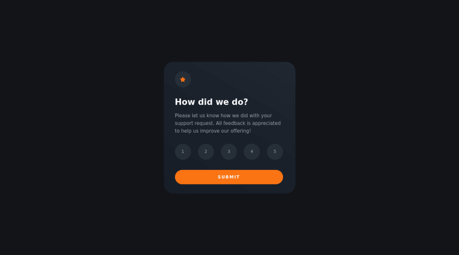
Simple component using html, css and Javascript.
Design comparison
Solution retrospective
1 - The most difficult part of this project for me was created functions with Javascript that was be able to manipulate the DOM to add or remove the specific classes.
2 - I'm not sure about Mobile styles, I added media queries in the same main sheet of styles design for desktop. I think there is a better way to do it.
3 - Well I'd like that someone with more experience to look at my code and be able to recommend better practices.
Community feedback
- @FluffyKasPosted over 2 years ago
Hey,
It looks great! Your html is really neat and easy to read, well done on that ^^ The functionality of the component seems to work well too, although it would be nice to add a function to prevent users from submitting the thing without selecting any rating. Overall your css seems fine too, but there's a few bits you could improve on:
-
Avoid setting fixed heights on things. You don't need it, most of the time. Every element has their own height, if you wanna increase this, do so by adding padding to it. This goes to your card component itself as well as all the buttons.
-
In this challenge you could actually skip adding media queries I believe. Just swap your width to max-width.
-
Set your font-sizes in rem. Pixels aren't accessible: they won't scale if a user were to change their settings in the browser.
-
For some reason the font-family doesn't seem to work at the moment, it's just the browser's default sans serif font I can see.
-
You could try to use relative units instead of pixels not just for the fonts but for paddings, margins, widths as well. Using rem is an easy way to start out. I'd only use px for small things like border-radius or box-shadow.
Just to clear some confusion up regarding your 2nd point: when using just vanilla css, all your styles can go in one stylesheet, there's no need for separate sheets for desktop/mobile view. In fact, for easiness sake it's the best to keep media queries on the same stylesheet, always. Later on, when you start building bigger projects and you try out Sass/Less you can break your css into smaller modules, but even then css is usually broken into smaller bits based on the different sections of the websites and not media queries. But you'll see this yourself, as you get more experience in this ^^
As a recommendation, I'd say you should start working with the mobile view first though. It's usually a lot easier to adjust styles for the desktop with media queries than the other way around.
I hope I was able to help a bit! Good luck!
Marked as helpful1@iAmJoeDeveloperPosted over 2 years ago@FluffyKas
Thank you very much for taking the time to review my code, I am very grateful, I will work on those recommendations and update the repository, I will let you know when I do.
Thank you again!.
0 -
Please log in to post a comment
Log in with GitHubJoin our Discord community
Join thousands of Frontend Mentor community members taking the challenges, sharing resources, helping each other, and chatting about all things front-end!
Join our Discord