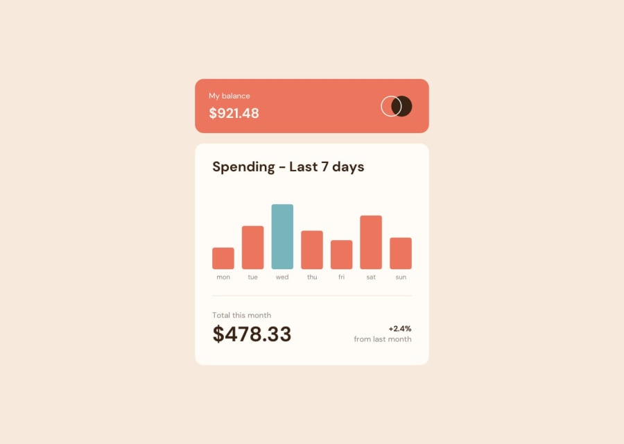
Simple Chart Component with Vanilla CSS and JS
Design comparison
Community feedback
- @abdellahelaajjouriPosted over 2 years ago
Hey There , Youre Solution is Perfect well done , But in the mobil layout you did forget to add the code the active state of the bar (hover) so added it for you . check out your code . Other than that everything is Very good . Good Jobe !
Marked as helpful0@solvedbiscuit71Posted over 2 years agoHi Abdellah, Thanks for your feedback. actually i have intentionally not added the hover state in mobile. since, it wasn't in the design files.
But, It makes sense to add the hover state in mobile so that users can view the amount spend on that day.
Thanks for bringing it up.
1@abdellahelaajjouriPosted over 2 years ago@solvedbiscuit71 its my pleasure i did learn a lot from reading your code . Can I aske your what system do you follow in righting your css code .
0@solvedbiscuit71Posted over 2 years agoI don't use any system (like custom properties) or naming convention (like BEM) since, it has some down falls. for example in BEM you have to follow 3 rules
- container (graph)
- element (graph__bar, graph__bar__tooltip, graph__label)
- modifier (graph__bar--highest)
But, as you can see for some simple components with less css using BEM is overkill (because the classname can get very long and messy). i would suggestion you to give it (or other system/naming convention) a try in your next challenge to figure whether it suits you or not.
0
Please log in to post a comment
Log in with GitHubJoin our Discord community
Join thousands of Frontend Mentor community members taking the challenges, sharing resources, helping each other, and chatting about all things front-end!
Join our Discord
