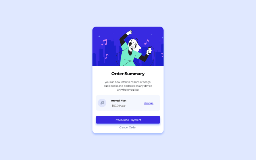
Design comparison
Solution retrospective
how to make the project responsive on mobile
Community feedback
- @SamadeenPosted over 2 years ago
Salam Omar!.. Cheers on completing the challenge.. I'd suggest you scale up your container a little then you'd be good to go.. Over all you did well. Secondly.. You might want to name your div without using the dash(-).. underscore(_) is better
Happy Coding!!!!
Marked as helpful0 - Account deleted
Hello there! 👋
Congratulations on finishing your challenge! 🎉
I have some feedback on this solution:
-
Always Use Semantic HTML instead of
divlike<main><header><footer>, etc for more info -
headings should only increase by one use h1 first then h2 etc..
-
you can make it responsive by decreasing the container width on small screens using @media queries
i hope this is helpful and goodluck
Marked as helpful0 -
- @NaveenGumastePosted over 2 years ago
Hello omar ! Congo 👏 on completing this challenge
Let's look at some of your issues, shall we:
-
Add Main tag after body
<main class="container"></main> -
Headings should only increase by one use h1 first then h2 etc
happy Coding😀
0
Please log in to post a comment
Log in with GitHubJoin our Discord community
Join thousands of Frontend Mentor community members taking the challenges, sharing resources, helping each other, and chatting about all things front-end!
Join our Discord
